You can use the Menu in the upper right corner of the homepage to view some art by category without narratives…
Or, Scroll down on the homepage to view all posts with narratives from most recent at the top to the earliest in 2013 at the bottom.
You can use the Menu in the upper right corner of the homepage to view some art by category without narratives…
Or, Scroll down on the homepage to view all posts with narratives from most recent at the top to the earliest in 2013 at the bottom.
In the final pastel class, Laura Pommier used a reference photo to instruct values in a portrait.
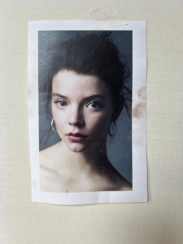

About an hour.
Pleased with the likeness. Subconsciously missed the slight head tilt, though. Too posed for me, I guess. Nice job with the values, I think.
Progress not perfection.
Decided to try to salvage this painting done from a reference photo in pastel class and posted here last week.
The reference photo was a complex value study in black and white.


My painting was a Fail. It was too dark and did not show the higher values in the shadows.

First, applied painters tape to remove layers of pastel in the figure.

Was somewhat successful in removing a couple top layers of low value pastel from the figure.
Then, went back in and added higher value lavender, blue, and gray to the figure, strengthened the chair, and enhanced the light and shadows throughout the piece.
Tap the image below to examine the painting.

About an hour making the corrections. Total 2 hours from initial painting to corrected final piece.

(*Note: Just found this in my unpublished drafts. Was painted back in April 2020 and never posted to my blog. Was about that time COVID set me back for over a year. Worked on it a bit since and the finished painting can be found in the Landscape area of the site Menu. It is been hanging on the wall in my Florida Room across the pond from its inspiration.)
======================================
With my home studio finished, starting to do larger paintings.
This oil painting is the view across from my Florida Room… It is part of my Trinity Series with three dominant clouds representing the Holy Trinity… Easy to see a Higher Power at work in nature, right??…

Started with a 12”x12” oil sketch to test the colors, image, composition, and identify problem areas to resolve. You can see the changes in the final painting at the top of this post. This process worked well for me and will use it for larger paintings. Will return to this small painting and finish it…
I paint from life, and my skills and style are evolving. Pleased with this effort. Though colors in nature have more gray than we realize, modified the hues with tinting and complementary colors. Added touches of pale orange in the blue sky to create a violet hue. Hat tip to the Impressionists…
Want to find a simpler way to represent palm fronds while staying true to life and without getting too stylized. This was a first effort…
Progress not perfection…
Haven’t done any pastels in almost a decade. Decided to take a Pastel class with Laura Pommier, a follow up to the Portrait drawing class I took with her earlier.
These sketches were from reference photos she provided.

About an hour. Fail. Badly executed and overdone. Figure itself is ok, but couldn’t quite figure out how to render the complex light and shadow values with purples. Needed more higher value lavenders and blues.

About an hour. Love this pose and pleased with the drawing (or is it a painting?) Captured the sense of movement and the figure gesture. Leg and foot positions are off and need to be corrected.
Enjoying this pastel class. Have worked exclusively from life and plein air in my art. Will try to do some landscapes from reference photos. Maybe some figure and still life. Perhaps it will inspire me to work.
Sure miss belonging to a weekly figure and portrait drawing group.
Progress not perfection.

Found this among my photos.
Live model painted during open session in January 2014.
2 hours
More than a decade later, wondering why I didn’t paint more often with acrylics.
It was about this time I started working in oils and studied with Kevin Murphy and later Yuri Yurov.
Progress not perfection.

Been a few years since any portrait drawing… or any drawing, really…
This drawing was for a friend. His daughter Kristin passed away after an heroic battle against cancer.
Left the face partially unfinished like her young life. In its place, God’s light shines on Kristen.
Progress not perfection.
2 Hours.
Worked from reference photos. Pleased with the outcome given the lack of recent drawing.
Note: To get back into drawing, took a six week figure drawing class with Craig Carl at the Sarasota Art Center… Figure drawing skills will take some regular work to recover. Need to find a weekly open studio with live models. Sure miss Yuri Yurov and my drawing friends in NJ.
Haven’t done any portrait drawing in the last several years, and sure do miss the weekly sessions at Yuri Yurov’s studio in NJ with Yuri, and regulars Dave Henderson, Ray Heinz, and Judy Leeds. All professional artists who were generous with their feedback and tips to this aspiring artist.
So, decided to take portrait drawing class at the Ringling College of Art with Laura Pommier, an accomplished artist and very good instructor. Visit www.laurapommier.com
Today was the third class. She uses both live models and photo references. Focus has been on getting started with the facial structure and facial values to achieve a likeness.
Here was my effort from a reference photo.

Accustomed to drawing portraits with General Charcoal Pencils or CarbOthello Pastel Pencils, so this was fun using lead pencils.
My last act before quitting was a swipe along her left jawline with the eraser. Applied too much pressure Should be a halftone like above the left brow and below the left eye. Let’s call that a fail.
Happy with the likeness.
Progress not perfection.
About an hour.
Haven’t done any drawing or painting in months. No reason.

After nearly eight years in Sarasota, finding the terrain flat and uninteresting. No seasonal colors, yet the greens full of warm and cool variations, values, and tones.
Trees are dominated by varieties of palms, also oak, magnolia, cypress, and red maple.
Challenge is finding any of these together in a natural setting. Designed landscaping is big business down here. Not very interesting to me as a plein air painter.
So, went to my failed paintings pile, found a small panel, a quick coat of yellow ochre, and gave it a new life.
My own imagined Florida landscape.
A rolling field of wild grasses and flowers leading to a lake with a distant autumn tree line as a backdrop.
A series of sun showers raining down in columns from a few rows of clouds marching across the sky, splashing in the lake.
Looser than my usual style.
Milton has left the area.
No flooding or serious damage in our condo community. A few trees down, including one felled into the pond outside my lanai, and the top half of what once was a magnificent 60 ft palm at our Clubhouse.
Our HOA says we were more fortunate than many others in Sarasota. Mainly debris pick up here.
My hurricane windows proved their worth. No breaks or leaks. Mighty happy about that.
Lost power, cable, cell service, and phone Wednesday at 7pm. Amazing how time slows in the absence of modern life distractions.
Got plenty of sleep and opened a new book Maureen had sent a year or so ago that was gathering dust. Couldn’t put it down. Read by flashlight at night.
“This Tender Land” by William Kent Krueger. Recommend it. Gifted observer, writer, and storyteller.
I won’t spoil the story but in it one of the lead characters, an orphan runaway from a Indian Training School in 1932 concludes there is a good God and a bad God.
He names the bad God the “Tornado God,” the vengeful bringer of chaos, punishment, and destruction.
I have always thought God is manifested in the wonders, the magnificence, and the mysteries of nature in our world.
Seems Hurricane Milton and his sister Hurricane Helene are reminders of our own Tornado God, circa 2024.
In God’s name we pray, Amen.
Progress not perfection.
Waiting for Hurricane Milton to reach landfall later today.
My area of Sarasota was ordered to evacuate. Decided to ride it out.
My condo is cinder block, poured concrete, and rebar. They don’t build condos like this anymore. We put new tile roofs on all our buildings and only lost a few tiles on a couple buildings during Hurricane Helene. Installed hurricane windows this past spring throughout my ground floor condo, so this storm will be a good test.
Bring it, Milton!
My place is about five miles from Little Sarasota Bay. My condo community had no flooding from Helene, and hoping for the same with Milton despite the warnings of 12-15 storm surge.
Always see God in nature. Always have.
Appears God must be pretty pissed right about now!
Will try to post a few post storm photos later this week.
Stay safe all!
Progress not perfection.

Just read an article about “How to know if your painting is complete” and it prompted me to take another look at a couple of mine.
Happy I did. Neither left the studio and now I see why. Both needed finishing attention.
Will describe what changes were made when they’re finished… again
Progress not perfection.

Made an initial visit to view this magnificent exhibit at the Ringling Museum of Art here in Sarasota…
Will let the Curator describe it…
DRAWING AS DISCIPLINE
The sixteenth-century painter and art historian Giorgio Vasari called drawing, or disegno, “the father of our three arts: architecture, sculpture, and painting.” Fundamental to the creative process, drawing was the backbone of artistic training in Renaissance Italy and consisted of two principal components: copying from a variety of artistic sources and studying the human figure. Through the mid-fifteenth century, aspiring artists were instructed to make copies after drawings in a model-book, a compendium of motifs (human figures, flora, and fauna) passed from one generation to another, ready to be inserted into paintings or illuminated manuscripts.
With the shift away from this medieval tradition and toward a greater emphasis on individual expression, artists increasingly copied from a wider variety of easily available sources, such as prints, plaster casts, and ancient sculpture, to hone and perfect their draftsmanship. Workshops and professional academies provided the principal context for the study of anatomy and the figure in motion, with apprentices and students often posing as models for life-drawing sessions.


Cleaning up the studio… Came across this sweet little oil painting done while studying with Kevin Murphy several years back at his NJ Art Academy.
Beautiful still life set-up… Full of shapes, angles, arcs, colors, values, tones, and shades.
As I get prepared to pick up my brushes again, what a wonderful reminder… of what makes a still life painting interesting.
Progress not perfection


With no open studio nearby and preoccupied with finding a new home, needed to do some drawing to test my portrait skills after a year.
Geralda is a lady friend who emigrated from Brazil. She has the most beautiful skin. After some coaxing, she agreed to sit for a couple portrait sessions. Geralda has a calm beauty I hope to capture in future drawings and paintings…

90 minutes…
Progress not perfection…
Note: Reposting…These images were posted in 2019-20 but lost when I updated WordPress.
Hasn’t been much work posted this year… Took a break and finding it hard to pick it back up…
Read a post by Dan Scott, an artist, writer, and teacher… about the importance of Practice and Theory… He reminded me of the value of studying art history and art movements… Just the nudge I needed…
Went back and reviewed my earlier work… Found these three paintings instructive…

Here is the photo that was the inspiration for a painting… Seward Johnson’s iconic sculpture, Unconditional Surrender, located at Downtown Sarasota’s waterfront… You can see the grid I created over the photo to aid my painting…
And below the first quick study… 8”x10” oil on canvas panel… Introduced a three cloud image, part of an ongoing Trinity metaphor I favor… Loose brushwork… Sargent a big influence on me…

Note to self: Have lost some of the energy in recent work pursuing more refined brushwork… Want to find a balance…
Continued to advance the study… Changed the viewing angle and perspective slightly… different platform and foreground… Lost some vitality and power, I think…

Visited the sculpture to take reference photos


Starting with an iconic sculpture celebrating the end of WWII… prompted a painting with its own vision of the event… The finished painting… 30”x30” oil on linen…

And in keeping with the subsequently renamed Johnson sculpture, Embracing Peace…decided on a more caring pose… with a more upright and relaxed posture… in front of a floating Tree of Life… under clouds representing the Christian Deity… Matthew 28:19 (baptized in one name, yet three Persons—Father, Son, and Spirit)…
So, what did I rediscover…
The source of inspiration is found not only in nature, the natural world around us, and our imagination… it is also found in great art…
So, taking Dan Scott’s advice… will be studying my art history books… visiting the Ringling Museum art collection… seeking ideas to appreciate… to practice… and to be the seeds of future paintings… for this aspiring artist…
Progress not perfection…

My home faces East, and each morning I am greeted by dawn skies….
Some are extraordinary… full of oranges, pinks, blues, blacks, and grays… Cloud shapes run from stratus, through altocumulus and cumulus, to towering cumulonimbus… each reflecting the dawn colors…
This painting is an imagined beach scene… (I live a few miles from Siesta Key Beach) dominated by three clouds representing the Trinity… rising behind scattered dark unlit clouds… framed by sand dunes in Light and Shadow…
Wanted to project the majesty of nature… as nature is God to me… while challenging the rule in landscape painting that either the sky or the land should dominate the horizon line…
Progress not perfection…
Experienced this unique exhibit today… An extraordinary opportunity to see… and be immersed in… Van Gogh works digitally projected… both full paintings and close-up images… accompanied by a chronological story line of his life history, short as it was… and a contemplative musical score to set the mood…
Here are just a few of the images today…


The exhibit continues in cities across the country… and the world… Highly recommend it…
“Only when I fall do I get up again.” Van Gogh
Whether you are a young artist wanting to make art your life’s work… or a hobbyist like me… there is plenty of insight and value for you in the advice of Jerry Saltz…
VULTURE GUIDES NOV. 27, 2018
By Jerry Saltz

Art is for anyone. It’s just not for everyone. I know this viscerally, as a would-be artist who burned out. I wrote about that last year, and ever since, I’ve been beset — every lecture I give, every gallery I pop my head into, somebody is asking me for advice. What they’re really asking is “How can I be an artist?”
When, last month, Banksy jerry-rigged a frame to shred a painting just when it was auctioned, I could almost hear the whispers: “Is that art?” This fall, the biggest museum event in New York is the Whitney’s retrospective of Andy Warhol — the paradigmatic self-made, make-anything-art-and-yourself-famous artist. Today, we are all Andy’s children, especially in the age of Instagram, which has trained everyone to think visually and to look at our regular lives as fodder for aesthetic output.
How do you get from there to making real art, great art? There’s no special way; everyone has their own path. Yet, over the years, I’ve found myself giving the same bits of advice. Most of them were simply gleaned from looking at art, then looking some more. Others from listening to artists talk about their work and their struggles. (Everyone’s a narcissist.) I’ve even stolen a couple from my wife.
There are 33 rules — and they really are all you need to know to make a life for yourself in art. Or 34, if you count “Always be nice, generous, and open with others and take good care of your teeth.” And No. 35: “Fake it till you make it.”
Keep reading… You will not be disappointed…
https://www.vulture.com/2018/11/jerry-saltz-how-to-be-an-artist.html
If you are an artist who paints or you simply love great art… and you haven’t seen this video… it is worth 33 minutes of your time… Enjoy…

This Sarasota park includes acres of yellow pine flat woods… with savanna vegetation ranging between grasslands and forest…
Many of the residential communities surrounding Sarasota sit on former farms and ranches that used flat woods for raising crops and grazing cattle…
There are no crops or cattle in the park today … Instead, it is a popular recreation site for camping, kayaking, fishing, and hiking…
Found these two towering slash pines… representative of South Florida flat woods… sitting apart from the nearby forest…… and worthy of a painting…
Six hours total…
Progress not perfection…

Visited Ulfer Family Park in Sarasota and found this trail…
The light and shadows invited me to do a small painting…
South Florida is in a wet tropical climate zone…Wanted to capture the feeling of the mid afternoon heat… and the humid, hazy sky… Pleased with the effect…
Florida flora… native grasses, plants, shrubs and trees… don’t change color much with the seasons… but do offer a wide range of greens…
Deep greens, blue greens, yellow greens, red greens, orange greens, violet greens, brown greens… in all manner of tints and shades…
In this painting, the variety of greens and time of day begged for a bold warm shadow… readily achieved mixing Cad Red, Ultramarine Blue, and Burnt Umber…
3 hours total… Golden Open Acrylic paints… RayMar canvas panel…
Progress not perfection…

Found a Plein Air painting group here in Sarasota… Light Chasers… and joined them for their inaugural 2021 session… Their season is October through May… when temperatures are cooler here…
The group met at Twin Oaks Park… and I quickly found my subject… the Twin Oaks… while others gravitated to the ponds…
These two oak trees… with hanging Spanish Moss… and a few low, meandering twisted limbs… formed a huge canopy… and cast a large shadow on the rolling lawn… in front of towering white clouds…
I see God in nature and thoroughly enjoy painting plein air… experiencing communion with my Maker for a few hours…
Hadn’t done any plein air since arriving in Sarasota in 2018… or any acrylic painting since studying with Yuri Yurov 2017-2018… Been painting exclusively in oils… Neither Yuri nor Dave Henderson have much regard for acrylic paints…
Must say, what acrylics lack in range and complexity… they make up for in ease of use and drying time…
Golden Open Acrylic… a slow drying paint… is perfectly suited for plein air painting, especially here in Florida…
Total 3 hours… Two on-site; one in studio…
Progress not perfection…

An artist friend sent me this painting today… America will never forget…

Will call this painting finished…
If you saw the prior post, the Trinity cloud formation has been reconfigured to better keep the viewer’s eye inside the painting…
Decided to add grass to the peninsula… and touched up the lily pads with a dash of red and yellow…
Reflection and ripples below the bird are clumsy… but they support the image without competing with it…
When pondering whether to scrape them and go back in… I heard John Singer Sargent whispering in my head… “The painting is not about the reflection and ripples… It is about the Roseate Spoonbill”…
Here is the reference photo sent to me by Sarasota Artist and Photographer, Pat Donnelly… She is skilled wildlife photographer…
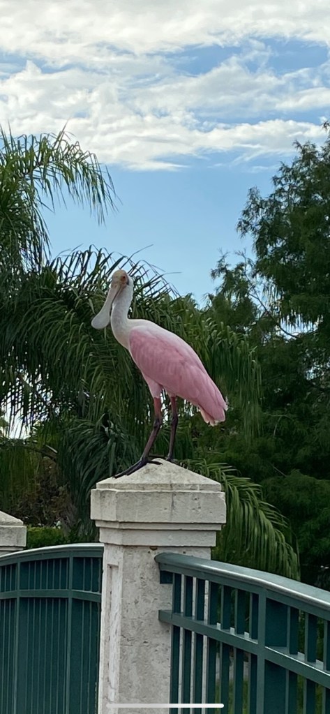
I draw and paint by observation… Got the likeness… and prefer my imagined natural setting rather than the column on the bridge… It’s my world, after all…
Progress not perfection…
Note: My Trinity Series incorporates three interconnected clouds symbolizing the Christian concept of God, the Holy Trinity… Father, Son, and Holy Spirit…
Nature is God… All around us…

A photographer in my community sent me a photo of a Roseate Spoonbill… preening atop a column of a small walking bridge near her home… For my painting, imagined a more natural setting on a pond… taking an idea from Sargent…
Find it helpful to photograph a painting near completion to decide on finishing items…
Needs more work on the reflected clouds, the shallows, and the peninsula… some muted colors…
Finish the feathers and soften the edges of the body…
Add variety to the light on the ripples and add slight shadows for depth… without drawing too much attention…
Been working on it off and on with a few other paintings for a couple months… Want to finish it this week…
Progress not perfection…

This drawing started as a quick, “end of session” 30 minute portrait with Kevin posing…
Usually, portrait drawings take me 90 minutes with a model… and some later finishing time… My attempt to short-stop my process was a fail… No likeness… No life…
Couldn’t let that stand, so used the reference photo to make corrections and finish the portrait the next day…
It is difficult to correct errors in the foundation of a drawing after proceeding into details… Better to get the structure right before making too many marks… There were plane and aspect errors in the structure of my quick effort that were mostly corrected…
After an hour of erasing and correcting, was able to get a very good likeness and salvage the drawing…
Laughably, even my initials had to be erased and moved… They were too close to the portrait and a distraction… There is a lesson in there…
Materials: Borden & Riley Pastel & Charcoal Paper #410, Generals Soft Charcoal Pencil, TomBow Mono Zero Erasers and Generals Gum Eraser…
The paper has a gray tone and a deep laid finish…Given a choice, I prefer Strathmore Series 500 Charcoal Paper with a more shallow laid finish…
90 minutes…
Progress not perfection…

Had the second Life Drawing session with a model in my home studio today…
So happy to be drawing from life again…
Beautiful young woman, who had done some light art modeling previously and wants to do more…
Dre has a goth look… Purple hair, nose and lip jewelry, and tattoos… I do not draw jewelry or tattoos… Will ask Dre to sit for a future portrait or figure painting and include them then…
Had her sitting on a new settee I just got for the studio… under overhead warm lighting… with a slightly elevated pose…
Got a good likeness today… Placement and use of available paper was good… Mark making just ok…
Model has great flowing hair… Didn’t do it justice… Though any more attention to her hair would detract from the portrait… Balance in all things, I say… Still, it is wanting in representing the shape, flow, and depth of her hair…
Drawing is on Strathmore Charcoal Paper with a laid finish… Stabilo CarbOthello 1400/645 pastel pencil…
90 minutes…
Progress not perfection…

Had the first Life Drawing session with a model in my home studio today…
Used to attend an open session at least once a week a few years ago in NJ… Want to restore my rusty skills… Plan to have a model in for portrait or figure work a couple times a month…
After several portrait drawing classes a decade ago… and attending weekly life drawing open sessions for several years, I draw from sight without any particular approach…
Pleased with this first effort… Got a good likeness… Placement and use of the available paper were good… and my mark-making is ok…
Want to move to the next level to capture other dimensions from a live model… My stretch goal is to convey more attitude, humanity, and life force in my portrait and figure drawing…
Drawing is on Strathmore Charcoal Paper with a laid finish… Stabilo CarbOthello 1400/645 pastel pencil…
This was a three hour Long Pose session with the model… Spend the first 45 minutes or so getting to know each other, getting Model Agreement signed, and testing poses and lighting… 20 minutes in pose with 5 minute breaks… Total drawing time 2 hours…
Progress not perfection…

Note: Changed my WordPress Theme and this post from May 2020 was corrupted, so reposting today…
This is the view from my Florida Room… Been working on this off and on for a few months… Needed to get it off my easel… As Da Vinci is quoted, “Art is never finished, only abandoned.” This painting is on my dining room wall now, with a window view of the actual palm across the pond… Birds are daily visitors like this small flock of Ibis… I can always take it down if I see something that needs attention…
My Trinity Series paintings include three connected clouds representing the Holy Trinity… Father, Son, and Holy Spirit… To me, nature is a divine gift to man…
Pleased with the composition, key, and values… Fronds got too fussy… but the painting conveys a sense of calm… The orange strokes in the blue skies creates a violet hue… my Hat Tip to the Impressionists…
Still progressing as an artist… finding my way with materials and techniques… Long journey ahead…
About 60 hours total
Progress not perfection…

Started this painting in an open figure session at Ivan Bratko’s Livingston, NJ studio in 2015…
Back at home, imagined and added the dawn beach setting… Put it aside…

Brought it to Sarasota in 2018…. Took it out of storage recently… After looking at it for a few weeks, decided to add the sheer nightgown…
Still needs minor light, shadow, and color corrections… May revise the cloud line and make it part of my Trinity Series… We’ll see… Putting it aside for now… Will finish it this spring…
Progress not perfection…

First portrait drawing in months… Wonderful model… A neighbor who lived through the years after the Bolshevik Revolution before emigrating to the USA…
Expressive face… full of character earned over a lifetime… A joy to draw… Got a solid likeness…
Will ask her to sit again with different head positions… hoping to capture emotions conveyed in her eyes and face…
Stabilo CarbOthello Pastel 645 pencil and General’s White pencil on Strathmore 500 Series paper…
2 hours…
Progress not perfection…

Started this months ago… Put it aside… Would keep working on it… but it is finished for now…
It is a tribute to Seward Johnson’s iconic sculpture “Unconditional Surrender,”reimagined by me…
My version depicts a less aggressive posture, a more loving welcome home between a WWII couple… in an imagined open field on Sarasota Bay… with a hat tip to the Surrealist Magritte and a floating Tree of Life… Hockney stylized branches… Turner harbor ghost ships… and to Monet with small pink clouds floating in the blue sky…
It is also part of my Trinity Series paintings… each with symbolic three clouds representing the Father, Son, and Holy Spirit…
God is all around us in the natural world… We just have to learn to see… like an artist…
Progress not perfection…

Relocated to Sarasota in 2018 and, after nearly a year as a renter researching communities, bought a condo late last year. Remodeled the place, including converting a small den into a home studio…

A Tueller Wall Easel, handcrafted by Jason Tueller at Paper Bird Studio, makes working on both larger paintings and multiple pieces much easier. Also, put caster wheels on a butler side table. Spray painted one side of a double-paned beveled glass with a dark gray, installed and sealed it on the wooden tray top. Now have a nice mobile neutral palette…

Small work and storage area, and 5 drawer cabinet on casters, make it easy to keep the area organized and clean. Keeping it simple lets me quickly find what I need…

Removed closet doors, expanded the space, and installed spotlights for lighting and shadow effects. Had a sturdy platform built with locking caster wheels so it can be moved to the other side of the room to also get natural southern light when desired, next best thing to northern exposure.
Use the chair for portrait work, the settee for figure work, and a table for still life set-ups. removing those not in use. Put locking caster wheels on my stand-alone easel in the top photo and use it so I can look directly at the model or still life and sight-size when drawing or painting…
Have a utility sink within 15 feet, and mounted wall shelves within 20 feet in the garage for unused canvas storage to complete the set-up…
All in all, pretty good use of space for a hobbyist and aspiring artist…
Progress not perfection…

All moved into my condo… Home studio is nearly finished… so happy to be painting again.
Seward’s sculpture “Unconditional Surrender” is a Sarasota bay front landmark… It was a natural to paint… Plan to do a 30×40 oil copy soon….
This is part of a Sarasota Trinity Series… (Three connected clouds will be in each painting)… Why??… Easy answer… Living in Sarasota… is like being in Paradise!!
Progress not perfection…

This is a still life painting set up by Yuri Yurov when I was studying with him in 2017. It needs corrections in the shape of the wine glass, the pottery piece, completion of the vine, and overall finishing effects.
Here is an early version…

I moved from Morristown NJ to Sarasota FL in 2018 and have taken a break from my art. When I get settled here, will take this painting up again.
Progress not perfection…

Birdhouse
16×20 oil on canvas panel
Birdhouse in my backyard done at request of my darlin’ and gift to her. More fun illustration than fine art. Looks like it belongs in a children’s book : )
Progress not perfection…

Holy Trinity Church
11×14 acrylic on canvas panel
Spent a couple hours on-site… Finished in studio…
Progress not perfection…

18″x 24″ Oil on canvas
A still life set up by Yuri Yurov for my training…


18 x 18 Oil on canvas

18 x 24 Oil on canvas panel

18 x 18 Oil on canvas

18 x 24 Oil on canvas panel
 Work in Progress
Has been awhile since I posted, but I have been painting, mostly on previously posted work.
This is a new painting started at Yuri Yurov’s open session last month that I put aside and got back to this morning in my home studio. The model is a beautiful young woman from Columbia who has golden brown skin. Wonderful opportunity for me to work on painting skin tones and atmosphere; still have work to do on both. Looking at it now, think I will also change the color of the pillow so it is less distracting and better supports the figure.
Yuri said the image was too small and didn’t utilize the available canvas. He also didn’t like the skin tone palette on the left. Points taken. Although the image is not as large as it might have been and the palette is not part of the setting, both work for me in this painting; the palette is part of the composition as information for the viewer.
8 hours total so far.
Progress not perfection.
 Still Life #2
This is the second still life Yuri Yurov set up for my instruction. Looks simple enough, but I struggled with it. The ellipses and the forms were not the problem; it was the colors and tones on the kettle, the cup and saucer, the lemon and the fabric. Did I miss anything?? Yuri gave me his detailed critique and said it was okay, and I learned from the experience, so decided to move on to something else.
9 hours at Yuri’s and 3 hours at home; total 12 hours.
Progress not perfection.
 Still Life #3
This is the third still life completed under the instruction of Yuri Yurov. Overall it is okay for my level of experience.
The yellow brush handle could be better and the colors and tones of the brush heads could be made more interesting. Think I did okay with the atmosphere, light and shadows. Was painted in late fall afternoon natural light. Much attention to the combination of warm and cool temperature of the paper notepad, the folds and fabric. The fabric had a monochromatic paisley-like texture pattern. Don’t have the skills to mimic pattern yet. Tried to create interest with the illusion of texture. Yuri said he will show me how to create the illusion of pattern using a fan brush in a future lesson.
For now, my focus is on process: seeing, composing, drawing, defining shadows, applying color and brush work. Within the process I am trying to advance my execution of creating an illusion of reality using light and shadow, values, color and temperature.
12 hours at Yuri’s and 6 hours at home. 18 hours total.
Progress not perfection.
 “Mike”
Yuri Yurov suggested I do oil sketches on canvas at the Wednesday Night open sessions to give me more practice on my values and my brush work. Must say, I do get great pleasure using paint and a brush. Bought a 10 sheet Frederix canvas pad; real canvas, medium texture, primed and ready for painting.
Before beginning, lightly applied poppy oil with a rag to facilitate movement of the paint and allow me to wipe away paint to achieve tonal variations. Used Burnt Sienna for the sketch.
Great model. Fantastic facial features. Was able to get a very good likeness.
Toward the end of the session, I introduced Titanium White to modify some of the existing tones. Mistake. Forgot when mixed with Burnt Sienna it creates a cool gray color. If I use Titanium White and Burnt Sienna for oil sketches in the future, think I will mix five values in advance. It is more work than using a rag to create different values, but it has its own charm as a grisaille. Will be a little more observant of the atmosphere as well. Those dark marks behind the head are distracting.

As a prelude to the session, did an oil sketch from a photo Yuri sent out announcing the model and changed the direction of the eyes. Gave me a chance to try out the canvas. It accepts paint readily. Will put a second coat of gesso on before beginning a sketch next time to see if it makes any difference in moving the paint around. Yuri uses Canson Canva paper to paint his oil sketches. It is paper, not canvas, but he puts on a coat of gesso before painting. I will buy a Canson Canva pad after I use up the Frederix canvas pad to test it out.
About 2 hours on each sketch
Progress not perfection.

18 x 24 oil on canvas
Started taking painting instruction with Yuri Yurov, twice a week in three hour sessions. What an opportunity!
This is the first still life set up by Yuri. Worked under his instruction for three sessions, and finished at home. Think the set up reflects his classical training and sensibilities. I aspire to learn to paint realism and hope to achieve my own “signature” style with experience.
There are a few issues. Placement on the canvas is too close to the right edge. The drape is velvet and I didn’t quite achieve the illusion (“Close”, as they say in the south). All the edges in the image are soft and in looking at it now, I could have used some sharper edges on the objects, especially the apple and tea cup in the foreground, to create a depth of field and focal points. Otherwise, pleased with the effort and result for my level of experience. Especially like the reflection of the teacup and saucer in the vase.
Total 12 hours.
Progress not perfection
 James
JamesHave drawn this model a couple times in other sessions. Flowing salt and pepper hair and beard with strong facial planes make for a great evening of drawing. The model was sitting with his right arm resting on top of the back of his chair. Took a position to do a profile portrait. Liked the composition with his arm in view.
Yuri has been talking with me about not drawing so small and using the full paper. He said there is a perfect size for every image (or canvas) and you can see when it fits its space perfectly, so made a conscious decision to draw this portrait bigger setting the outside envelope closer the the edges than I have in the past.
After establishing my placement, started building the big shapes – face, hair, beard, arm – then moved to find the facial landmarks – forehead, brow, eyes, nose, mouth, chin – checking and correcting the proportions. As I added shadows, a nice likeness emerged on the paper. The rest of the session was spent refining and finishing.
Yuri came by at the end of the evening and suggested the head might be too big. He took his hand and spread his palm in front of his face. “The face should be no larger than your hand.” Told Yuri I learned that from Ed Sprafkin and spread my hand in front of the image to show him it was in fact the same size. Think the foreshortened arm, shoulder length hair, and beard give the impression the face is larger than life.
Yuri took his dark pastel stick and followed my line on the forehead profile saying it was an important line and needed to be accentuated. He also said no two shadows are alike, and lightly touched my facial shadows with the side of his dark stick. Using the side of a crayon to shade creates subtle differences as opposed to shading and blending; a valuable lesson here.
Pleased with the drawing. The model liked it as well and took a photo.
2 hours.
Progress not perfection.
 Draped Nude Study
Good session at Yuri’s last night. Drawn this model many times. She is a real professional who knows how to pose.
Spent a couple minutes thinking about my composition. Had a nice vantage point to draw the full seated figure, so decided to do it. At my stage of development, I prefer to draw and paint the full figure to practice anatomical proportions, structure, and planes.
It also gives me an opportunity to practice my pencil lines – lines that follow the anatomy using both pressure and the width to describe light and shadow and express the “life inside the figure.” To me, this is the art of figure drawing and a skill I aspire to learn and master.
Yuri nodded his approval during a couple breaks and came by after the session to compliment me on the composition. He said I almost made optimum use of the paper, and that my figure could have been slightly larger. He said composition is critical – if it fails it doesn’t matter how good the details are done.
He also encouraged me to think about how to bring the viewer “inside the drawing” instead of the drawing projecting itself on the viewer. Think it is all about depth and atmosphere and something I still need to learn.
Total 2 hours.
Progress not perfection.
 Reclining Nude
Same model. New three week pose. Crowded studio, so took a position others avoided. Always up for a challenge. You can see the ghost lines – evidence of plenty of correction : )
2 hours.
Progress not perfection.
 Resting Nude Study
Been experimenting with acrylic sketches at open figure sessions, so this is my first drawing in awhile. Decided to attempt a “crayon trois” using a charcoal pencil and red and white pastel pencils.
Wonderful model at Yuri Yurov’s open session last night- same model who has been posing for the sitting acrylic painting I’m doing and will post shortly – working at a different open session. Her hair is down and her face is hidden in the figure painting, but her hair is up and her face is revealed here. Beautiful girl.
Spent a little time deciding on the composition and happy with my choice. Yuri came by during a break and talked with me about the importance of composition. He said my composition was strong. He said if the composition is weak, the drawing (or painting) cannot be great regardless of the skills of the artist. He emphasized the process: concept and composition first; then big shapes in relation to each other to achieve accurate anatomy and proportions with special attention to light and shadows; finally finishing with artistic details guiding the viewer to the focal areas that support the concept.
He took my pencil and followed my lines of the face and shadows, checking my proportions, corrected the position of the right shoulder, neck and chest line, and moved the right breast up a bit and reduced the size. He gave me the pencil and left me to correct the left breast, the arms and hand. The message was clear. Check the proportions and positions early and often when drawing the big shapes and get them right before moving on to any detail. Really a privilege to be coached by a master artist.
I’m a little heavy handed with the red and white pencils, but for a first effort at crayon trois, I’m pleased. Will make some refinements tomorrow and repost. Need to work on my mark-making, especially in shadow areas. Ray Heinz has talked with me about being more cognizant of making marks that follow the shape of the form.
2 hours.
Progress not perfection.
 Kneeling Nude Study
Getting back to attending open sessions. Decided to start painting sketches at Riker Hill using Golden Open acrylics.
Cad Yellow, Cad Red, Ultramarine Blue, Titanium White, and Carbon Black.
60 minutes.
Progress not perfection
 Work in Progress
Same model and pose as last week at Ivan Bratko’s Studio. Took the same position.
Last week used Burnt Umber and Titanium White acrylic for grisaille. Used Mars Red and Titanium White oil this week.
Prepared the linen canvas by oiling out with 1:1 mix of Stand Oil and Gamsol. This stopped the paint from being absorbed into the canvas and allowed me to move the paint around on the surface and wipe to subtract and correct without staining the linen.
Something about this pose I just like. Elegant and rhythmic lines.
Didn’t do it justice. Get one more chance at it next week.
2 hours
Progress not perfection.
 18 x 24 pastel pencil on toned paper
Last night Yuri decided to move the model to the middle of the room. From my position, it created a challenging foreshortening problem. Yuri came by and looked at my vantage point before we started and said, “This is very complicated.” I responded, “I am fearless.” : )
First determined my placement on the page – top, bottom, and sides – then blocked in the big shapes with light lines. Working from the top, checking proportions against angles and landmarks, began to define the form with light lines, finding my way, correcting with my kneaded eraser often. Resized the head and legs a couple times to achieve the foreshortened illusion. Finished the drawing by creating the lines on the front leg as a focal point and carrying a line up the left side of the model with lesser pressure.
The other artists gave me good comments on the result. Happy with the outcome for my level of experience.
2 hours
Progress not perfection
 Work in Progress
Started this yesterday at Rikers Hill open figure session. This was the first of a three session pose. Knowing in advance this would be a reclining pose, took a position behind the stage before the model arrived. Every other artist positioned themselves in front of the stage, save one who joined me later. As the model established her pose, I was delighted with my vantage point.
My method is to use Burnt Umber acrylic paint to do a grisaille underpainting to start a figure study. Keeps me focused on the form, light and shadow. I first wet the panel, apply a fairly thin wash of paint with a broad brush, and wipe out the envelope of the figure with a paper towel. Then, using a brush, I begin to define the form, correcting as I go, focusing on anatomical landmarks. Finally, I introduce shadows. In future sessions, I switch to oils to advance and finish the painting.
Really like this pose. Instead of advancing this painting, I may use the two remaining sessions to do similar grisaille studies. Then again, I need to work on skin tones. What a conundrum.
90 minutes.
Progress not perfection.
 “Zaghara”
Decided to draw a portrait of our model at Yuri’s last night. Just didn’t care for the full figure pose from my position in the room.
Throughout the evening Dave Henderson, Ray Heinz, and Yuri Yurov stopped by during breaks and checked my progress. They all liked the composition and drawing. Was able to get a good likeness.
During the last break, Yuri came by and took my pencil. He showed me how to finish a drawing. Through the weight of his line, he made small refinements to the rhythm of the center line – brow, nose, lips, and chin. and darkened the eye to create a focal point. He also shaded the jaw line and cheek with lines over my lighter shadows. You can see my default method of shading on the neck, for example. I make light marks and blend with my fingers. After a few minutes, he left and I added white highlights.
It is so instructive to watch a master artist work. In this case, Yuri demonstrated how to take a good drawing through to a fine finish.
2 hours.
Progress not perfection.
One of my artist friends, Ray Heinz, sent me this article, The Painter’s Primer: A Survival Kit, published in LINEA, a print publication of the Art Student’s League in NYC.
Hope you find great value in it as I did.
Been studying once a week over the past 8 months with Kevin Murphy at his Art Academy. Taking a break for the summer. Worked the first few months on value drawings in charcoal. Then moved to still life set ups in grayscale with oils. Recently been painting in color. Each represents 3-4 hours at his studio. Forced me to focus to get as much done as possible given the time constraint. Wasn’t able to finish any, but probably a good thing given my habit of over-working. Trying to tame my perfectionist nature.

Here are the last of the grayscale paintings.

And below are the initial color paintings, the most recent at the bottom.


Still working to learn and use a repeatable process to make a painting. Need to overcome my tendency to move around a painting randomly based on what attracts my attention instead of working intentionally through stages to completion. Bad habits are hard to break. Once I own my process and it is intuitive, I can adjust it to meet my needs.
Will start again with my lessons in September.
Progress not perfection.
 Sitting Nude
Very nice pose with a very good model presented real potential for a special drawing last night at Yuri’s open session. Did a decent drawing but wasn’t quite able to pull off anything special.
Yuri came by during one of the early breaks and took my pencil. He talked with me again about the quality of my lines. My lines tend to lack energy, so consequently the flesh on the figure looks lifeless or not as alive as it might look. As he has in the past, Yuri demonstrated by making a vertical line of varying weight, explaining how line follows the anatomy with light and shadow expressed in the line both inside and outside the figure; you can see it at the lower far right. He then enhanced my lines on the breast and the modeling on the left thigh. He also added a line to indicate the far buttock. When I said it wasn’t visible from my angle, Yuri replied, “But you know it is there and it looks good.” And therein lies a lesson. I still am constrained by my habit of drawing only what I see and not what I know about the anatomy.
Received a second valuable lesson from Ray Heinz. When I remarked how beautifully Yuri had rendered the face in his drawing and how it contrasted with my own unremarkable effort, Ray said it was because Yuri “edits” the information to what he needs to convey beauty in his drawings and paintings. I don’t edit what I see. To illustrate the truth in his observation, I pointed out just to the left of the knee cap of the left thigh, her foot tucked away and not visible but for a couple toes – toes I had drawn, of course. They were perfectly well rendered toes but didn’t “read” right without seeing the foot. We both laughed. As you can see, I subsequently “edited” out the toes with my kneaded eraser. Always learning…
2 hours. Two valuable lessons.
Progress not perfection.
If you asked me what my ultimate goal is with my art I would tell you it is to create narrative figure paintings and portraits. The human form and the human spirit are the subjects that interest me the most, and present a formidable challenge as I learn to draw and paint.
 “James”
Those of you who follow this blog may recall this image painted last summer during an open session at Yuri’s (click to enlarge). The model was James, a friend of Yuri’s. I put this aside and have been thinking about how to proceed, if at all. Decided on a plan of action yesterday and got started.
 Work in Progress
Without the advantage of putting the model in a costume, pose and setting of my choice, I plan to create a narrative with my imagination. James at an indoor venue of some sort, a theater. Behind him, I’m planning a silhouette with ghost images of orchestra players and a conductor with a baton. In front of him will be a small number of audience members. Painting this as a grisaille with Burnt Umber and Titanium White. Keeping it simple…
Yesterday I blocked in a rough approximation of the orchestra form without any detail, created the audience members in front of the stage, added a couple of balcony forms, and cleaned up the facial features to achieve a likeness of James using a reference photo.
I am still in the basic learning stage with several years of work ahead of me before I can get serious about producing narrative art. That said, I’ve got to start sometime, so this is an early attempt at exercising my imagination, employing the knowledge acquired to date about composition, the human form, and oil painting, and proceeding to address the problems involved in creating an interesting narrative painting.
4 hours total so far.
Progress not perfection.
 “Coffee and Cognac”
Finally finished this second still life started in a painting class with Elaine Kurie last fall. Kurie incorporates reflections in her recent work, so no surprise she set up a still life for the class that included this element. It was an interesting challenge in the first still life she set up for the class as well.
This painting went through stages. Grisaille underpainting to block in the forms, then a couple subsequent levels of correction, color and refinement before finishing.
 “Work in Progress”
 “Work In Progress”
 “Work in Progress”
Changed the shape of cloth form to lead the viewer into the painting and cut the length of the wheat stalks to bring them nearer to the glass forms and allow a close up of the overall still life.
Background of the set up was an off-white wall, so decided on a mix of Alizarin, Burnt Umber, and Ivory Black as a dramatic complement to the green fabric. Table top was a sheet of white paper I modified to a slightly creased white tablecloth in shadow. Pleased with the composition.
Tried to use more expressive brush work than the strokes I used in the first still life. Discovering I am not a good fit to precision painting. I am an eldest child, cursed to be a perfectionist. Only late in life am I learning to just let it go, and even now it is a struggle.
While I greatly admire the technique and product of precision painters like Elaine Kurie and other American Neo Realists, I am most attracted to the post Impressionist realism of Zorn and Sargent, and to contemporary painters like Richard Schmid and Daniel Gerhartz, among others.
12 hours total
Progress not perfection
 18 x 24 pastel pencil on Strathmore drawing paper
Started this drawing last week at Yuri’s. After the session, he said the model would return this week and suggested I continue working on this drawing rather than start a new study. Yuri said I had the foundation for a good drawing.
Took his counsel and worked this drawing to conclusion last night. Can see the value of the extra two hours. It is a much more finished drawing than I usually get done in a single two hour pose.
Yuri came by during the session and said I did a solid job on the figure and likeness. Our model had a longer than normal torso and legs, and Yuri said he noticed it as well when he did his own measurments.
I had feint ghosts of the settee legs. He took my pencil and added tone with horizontal marks to the legs as well as the lit area of her ponytail on her left side. I took his cue and did the same on the lit areas of the robe over each of her arms. It improved the look of the drawing and I will remember to do this to tone down direct light on objects.
Yuri said my drawing skills have reached a new level. Been attending his open session most weeks for a couple years, so he has observed my progress. Means a lot to know he sees the development; I do work at it. He told me there will be starts and stops in my progress but to not be satisfied with doing less in the future.
Total 4 hours.
Progress not perfection.
 18 x 24 charcoal with white highlights on toned paper
Same model and pose as previous couple weeks at Yuri’s. Kept the same position but decided to draw a close-up this week.
Face looks a bit wide. Left side of the face and forehead above the hand could have been better modeled. Looks flat. Could have taken the left eyebrow down a value as well, but otherwise happy with the composition and likeness. Better control of the materials; charcoal is not a strong suit for me.
2 hours.
Believe the same model will be in the same pose next week. What shall I draw??
Progress not perfection.
Been studying once a week with Kevin Murphy at his Art Academy since last fall. Worked the first few months on value drawings in charcoal. For past quarter been working on still life set ups in grayscale with oils. These are some recent efforts, each representing 3-4 hours at his studio.

Not any one of these was finished; simply ran out of time.

Most recent works show better efficiency, so had time to add some refinement.

My primary goal in studying with Kevin is to learn a repeatable process for starting and progressing through an oil painting. Also want to learn as much as he is able to teach me about the methods and techniques of representational painting.
 Progress not perfection.

Same model as last week. Same pose. Decided to leave my comfort zone and put aside the pastel pencil. Used soft vine charcoal on gray toned paper.
Yuri suggested my portrait was too small last week and didn’t take advantage of the paper size, and he was right. Made a larger drawing last night with the face – not a head and shoulder pose – the focal point. Much more powerful drawing than last week and more appropriate for a portrait.
Yuri came by and suggested I was pressing too hard on the charcoal – to use the side of the charcoal as well as the point and make soft marks. You can see his mark on the lower right side where he showed me how to make a dark mark without pressing hard on the point.
Made a nice looking drawing of a woman in a pensive mood but didn’t capture the model’s likeness. Was so focused on moving the charcoal around the paper and getting comfortable with the medium again, didn’t get her bemused expression either.
As they say in the south, “I was close.”
2 hours
Progress not perfection.
16 x 20 oil on belgian linen canvas panel
Spent a couple more hours working on this second still life set up created by Elaine Kurie for a painting class last fall.
Finding it difficult to get motivated to finish it. Get distracted by my own work. Promised myself to give it more attention this month.
The patience required to achieve hyperrealism is not a strength of mine, so this painting style is ill-suited to me. Prefer a looser and more expressive approach to painting. Trying to incorporate some of myself into this still life. Hope you can see it in the silk cloth, the three vessels, and the wheat stalks. Realistic but not so exact in the execution as the first Kurie still life set up I did last fall. More expressive brush work with softer edges in this painting.
Materials are Winsor & Newton oil paints. RayMar panel. Rosemary Brushes.
Palette is Alizarin Crimson, Burnt Umber, Ivory Black (background); Viridian, Light Green, Burnt Umber, Titanium White (silk cloth); Titanium White, Yellow Ochre, Ivory Black (bowl, shadows and tablecloth), Titanium White and Yellow Ochre (wheat stalks). Will add some cool color to the shadows, a warm glaze to the wheat stalks, and a raw sienna to the whiskey cap to simulate gold.
Still need to accomplish several things in the finishing stage:
Finish modeling the green silk cloth.
Finish the standing glass and add a slight ellipse at the lip.
Continue refining the top ellipse and modeling of the bowl, both interior and exterior.
Finish the whiskey bottle.
Refine the whiskey label and cap forms and add color.
Refine the cast shadows of all three vessels with attention to temperature.
Create reflections of color on the whiskey bottle, tall glass, and bowl.
Glaze color onto the wheat stalks.
Add highlights and accents.
8 hours total so far.
Progress not perfection.

18 x 24 pastel pencil on drawing paper
Our model was clothed last night so I decided to draw her portrait.
Last week Yuri suggested I watch him get started this time so he could demonstrate how he approaches his drawing. He moved his easel up next to mine. He was planning a portrait painting. Using what looked like a burnt umber and black mix, he made a few small brush marks around his canvas to serve as landmarks. He then made a big sweeping curved diagonal line from the bottom right side of the canvas up to the left top. This turned out to be the brim line of the hat; he planned a close-up composition.
He then started a grisaille underpainting to establish the form, values, shadows and light areas. He worked on the big shapes, correcting as he went without any attention to detail. Once he was satisfied with the oil sketch, he started to add color and deepen the values. The detail he did add was focused on the triangle capturing the expressive eyes, the nose and lips to achieve the likeness and spirit of the model. He only suggested an anatomically correct hand with no definition of the fingers save for a loosely drawn couple of shapes. A few color placements and the red hat in an otherwise low key value painting produced a quite dramatic and powerful portrait.
When Yuri looked at my drawing during a break, he said it wasn’t big enough. He meant that I might have made the face the focal point instead of making the pose the focal point. Looking at his portrait in comparison, he was right. He produced an artful portrait. I produced a stock illustration. Okay likeness. Lifeless expression. No atmosphere. Failed portrait. I started a new drawing in the remainder of the session.
What did I learn? To not start working until I have thoughtfully considered the compositional options. To find and project the drama and power of a pose. To use the full drawing area and not draw so small. To make the focal point of a head and shoulder portrait the facial triangle. To make the portrait subject expressive with special attention to the eyes and mouth. To keep working at it because I have a long way to go before I produce artful life drawings.
90 minutes. Used Stabilo CarbOthello 1400/645 pastel pencil on Canson 1557 Classic Cream Drawing paper.
Progress not perfection.

This was to be the last session in this pose with our model. As the fates would have it, our model was unable to make it, so we had a substitute model with about the same body shape.
Although she was put into the same pose and lighting, the posture and form were different, as were the cast shadows, head shape and likeness.
Decided to not chase the major changes too much and spent my time modeling the form with light and shadows, and adding some detail to the hair, face and hands.
2 hours today. 4 hours total. CarbOthello 1400/642 pastel pencil on Strathmore Drawing paper.
Progress not perfection.

18 x 24 pastel pencil on drawing paper
As the session was starting last night Yuri said to me, “You pick complicated positions.”
Our model was in the same pose as the previous week, and I positioned myself at an angle looking up toward the head. The drawing would require a foreshortened thigh, forearm, torso, neck and face. I like challenges.
Used Stabillo Carbothello 1400/642 pastel pencil. It has a softer color – almost mauve – than the 645 burnt sienna color. Ray Heinz said it looked more flesh-like.
Spent the first 20 minutes creating the envelope, using angles and landmarks (head to shoulder; elbow to forehead, ear to knee, breast to ear, etc.), and finding the center line of the head and torso, and the foreshortened position lines of the eyes, nose, lips, chin. Blocked in the hair and ear.
In the next segment, I marked the shadows: the cast shadow on her shoulder under the chin, the breast, forearm, knees and calf. Blocked in the hand. Then roughed in the foreshortened face, paying particular attention to the nose. Spent some time on the neck, throat, mastoid muscle.
For the remainder of the evening, modeled the form, defined the face, and made some corrections. You can see the ghost of the fingers indicating the position of the forearm changed.
And I destroyed the beauty of the drawing.
Never intended to define the hand and fingers to the point of distraction or to emphasize the eyes and eyebrows with such dark marks. But I did.
I got lost in the details.
At the evening’s close, Yuri came by and studied the drawing. He said the foreshortening wasn’t correct. As examples, the calf should be larger and the knee is too small in relation to the face. He said I spent too much time on the details and not enough time correcting the form during the session.
Yuri was right.
He said the goal of a figure drawing or painting is not to create photographic detail. It is to find the beauty of the pose. He suggested that next week I stand behind him and watch how he starts and proceeds through his oil sketch. What an opportunity to learn! Will be taking plenty of notes in my sketchbook.
2 hours.
Progress not perfection.

18 x 24 pastel pencil on drawing paper
Attended Ivan Bratko‘s weekly open figure session this morning; hadn’t been there in quite a while.
Ivan is a Ukranian-American artist who was classically trained in Russia, like our friend Yuri Yurov. As a matter of fact, Yuri was in the group today working on a painting he started last week. Ashleigh was the model, someone I’ve drawn several times at Yuri Yurov’s studio.
This was the second of three sessions in this pose, and I missed the first session, so with only one additional session in this pose, decided to draw; not enough time for me to paint at my stage of development.
Used Stabilo Carbothello 1400/642 pastel pencil on Strathmore Drawing paper.
After the session Yuri stopped by and said I made a good start. Usually at Yuri’s on Wednesday nights, we only have 2 hours to draw before the pose changes the following week.
In the final session of this pose next week, will focus on the face and torso – creating a rhythm of marks using line and tone to develop the values, the lights and the shadows – with a goal of bringing the drawing to life – one of my challenge areas.
2 hours.
Progress not perfection
 “Ashleigh”
This model has become a favorite of my drawing groups, so I get to draw her often. An art student, she understands how to hold a pose, re-establish her pose after a break, and how to present focal areas of a particular pose.
During an early break Yuri came by and said he liked my start. He encouraged me to imagine myself as a conductor, leading an orchestra of form, line, tone, value and atmosphere to create a drawing that pleases both me and the viewer. It is a useful analogy.
In the pose last night, tried to invite the viewer into the drawing at the feet, to the lower leg and knee, up to the abdomen and rib cage, shoulder and elbow, hair and face, top shoulder and arm, hip and hand. Most people read left to right, though, so many will start at the head, down the shoulder, arm, hand, hip, calf, feet, and back toward the head along the lower side of the model. Either works for me.
Dave Henderson liked my use of tone to define most of the form, and reminded me value changes define the inner body.
Both Yuri and Dave complimented my treatment of the hand on the hip. Went for an anatomically correct suggestion of the hand and a few visible fingers.
Used a Stabilo CarbOthello 1400/670 pastel pencil on Strathmore Series 400 toned tan paper.
2 hours.
Progress not perfection.

18 x 24 pastel pencil on toned paper
This young model posed for us previously unclothed and returned last night with a new haircut and colorful striped dress. As the fates would have it, only a few artists had color palettes.
With an interesting profile view, decided to draw her portrait with my drawing medium of choice: Stabilo Carb Othello 1400/645 pastel pencil on Strathmore 400 toned tan paper.
Lightly started sketching the big shapes, and after several minutes decided to move the image to the right to capture the right arm. It forms a nice anchor to the triangle of the head, and left elbow.
Worked the figure with light marks trying to find the right lines to shape the envelope using my kneaded eraser. Once satisfied with the general form, moved to the shape of the head and facial planes to achieve her likeness.
During a break, Yuri came by to remind me lines closer are darker and lines farther away are lighter. Continued to develop the form and added some details of her dress.
Dave Henderson came over during several breaks to compliment my progress. He suggested bringing out the belt by creating contrast with the dress rather than making darker lines. Took his advice and modeled her bosom and abdomen to follow the form and added shadow. It did define the belt.
Pleased with the composition. Achieved a spot on likeness. Dave said it is a really nice drawing. High praise from a master.
Total 2 hours.
Progress not perfection.

18 x 24 pastel pencil on toned paper
Same delightful model and challenging pose last night as the previous week. Decided to take a slightly different position and perspective; focus on the face and torso.
After the first break, Yuri came by and liked my start. “Don’t just draw what you see, though. Decide on your emphasis. Invite the viewer in with something interesting and lead the eyes around the drawing with thoughtful lines. Don’t press so hard on the pencil.”
He talked with me again about line quality. Took my pencil and demonstrated how to achieve line rhythm with slight weight and pressure changes. He has shown me this many times; I am a slow learner.
Toward the end of the session, Ray Heinz asked me how it was going. “I’m on a rescue mission, Ray” I said with a laugh.
Struggled with the face and you can see the battle lines. Her face was slightly elevated and the jaw line, chin and neck were challenging. Needed to put some emotion in the eyes; the blank stare is a fail.
Think the hair highlights work and convey volume and the hair in shadow above the shoulder attracts the eye to the head.
My intention was for the torso to co-star with the face, but it is flat and lifeless and subordinate. Just spent too much time on the head and needed to create more focus on the calf, thigh and hip with line weight; needed to better model the thigh, abdomen and breasts to show suppleness. It would have balanced the attention between the head and torso. Ran out of time.
Will get to draw this model in a new pose next week.
2 hours.
Progress not perfection.

18 x 24 pastel pencil on toned paper
Opportunity to draw this young woman again last night at Yuri’s. Our host bought a big leather couch at a local auction and it made a comfortable setting for the model. Expect we will see a lot of reclining poses in the future.
After changing the model’s position several times to make sure each artist had a decent pose, we began.
During the first break Yuri looked at my drawing and said I didn’t take advantage of the paper size. It was a nice block-in with correct proportions and setting, but of course he was right – my initial drawing was more of a mid range landscape than a figure study. So, I started again on a new paper.
Perhaps should have handled the feet like I did the hands with a loose impression, but they were in the foreground and at a challenging angle, so I went for slightly more definition in support of the calf line that leads the viewer to the thigh and into the pose.
Ray Heinz talked with me about drawing the facial “likeness” of the model in figure studies. He did a powerful pastel drawing with magnificent skin tones adorning the gesture, with no attempt at a facial likeness. A likeness would have distracted the viewer from the beauty of his piece. In contrast, my tendency is to draw a facial likeness in my figure studies, perhaps because of my portrait drawing experience. Will try to be more conscious of my tendency to make sure a facial likeness supports my figure drawing and doesn’t compete or detract from the finished work.
2 hours
Progress not perfection.


My weekly portrait drawing group disbanded some time ago, and I miss the regular practice.
Always prefer to draw from life, but in the absence of a live model, I use publicly published mug shots to keep my observation skills sharp.
Great practice drawing gender, racial, and ethnicity differences. Trying to capture the subtle – or not-so-subtle – facial expressions that convey the emotion of the moment is a fun challenge as well.
Use a mechanical graphite pencil in a 9 x 6 spiral sketch book.
About 45 minutes each.
Progress not perfection.
16 x 20 oil on linen canvas panel
This is the second still life arranged by Elaine Kurie for her painting class last fall. Put it aside after the final class and just getting back to it using a reference photo. Posted the block-in last October a few posts back.
Find it useful to photograph and examine work in progress. Helps me identify problems with composition, form, color, et al and plan next steps.
Background color is Alizarin, Burnt Umber, and Ultramarine Blue. Cloth is Cerulean Blue and Zinc Yellow Hue. Table cloth and bowl are Titanium White, Ivory Black, and Yellow Ochre.
Need to check symmetry and finish the decanter form.
Straighten tabletop and lines on tall glass.
Correct ellipse on bowl.
Rework the green cloth shape to improve the composition and add shadows and highlights.
Develop the refracted light and reflections in the whiskey decanter and tall glass.
Create the cap on the decanter.
Refine the shadows cast on the tabletop by the forms and create some depth in the dark background.
Add a couple wheat stalks in the tall glass.
At least this is what I see now.
Total 6 hours to date.
 “Ashleigh”
Holidays over, we were drawing at Yuri’s last night after a two week hiatus. Our model returned and took the same pose, so I was able to continue work on my drawing.
Yuri had talked to me about making lighter marks, so I softened the drawing with my kneaded eraser and restated some of the form and shadows. “Let the drawing emerge,” he said, and used the analogy of developing a print in a darkroom chemical wash. He reminded me to emphasize the image foreground and not its background – in this case the right forearm, hand and thigh and not the left side of the abdomen and left arm. “Lead your viewer into your drawing.”
Used shadow lines to define the forearm, hand and fingers, and pleased with the result. Maybe my marks are too light here as the lower half of the drawing looks washed out compared to the upper half. Could have given the viewer a stronger invitation into the drawing…
Strengthened the robe with white charcoal and restated highlights on the figure. Perhaps too strong on the face and clavicle. Lightly added to the draped atmosphere, and ran out of time.
2 hours. Total 4 hours.
Progress not perfection.

16 x 20 oil on linen canvas panel
Been painting but not getting any paintings finished. With the holidays over, need to get back at it.
This still life was set up by Elaine Kurie for her painting students last fall. It evokes a quiet, stark serenity.
It is my attempt at a kind of realism achieved by applying paint in thin layers and glazes with special attention to precise form, light, shadow, and reflection, as Elaine Kurie does in her flawless work.
This type of painting is challenging, but probably not a way I will want to work. Beyond subject matter, as I am learning to paint, am discovering what my tendencies are and how I apply paint and how I respond emotionally to what I lay down on the painting surface.
Added several lantern flowers, strengthened the reflections, and widened the standing vase. The narrow vase just didn’t work for me. This makes for a better composition to my eye.
Focal points are the black vase, three orange lantern flowers at the mouth of the vase, and the lone fallen flower on the left, supported by the shadows and reflections in the standing vase. The soft edges of the tablecloth in the foreground and background create a ephemeral depth of field that surrenders to the focal points.
Thought about dropping a couple more flowers on the table cloth behind and to the right and far left of the standing vase – and may still – but for now I’m calling this finished. Need to move on.
20 hours total.
Progress not perfection.
 “Ashleigh”
New model last night. Worked in black and white charcoal pencil.
Pleased with the result – good proportions and composition, but hand still needs work. Yuri did say my effort was the basis for a good drawing, but needed to be finished. He said an artist has to know where a drawing or painting is going before even making a mark. He said at any point when the goal is achieved, “like writing, you need to put a period at the end of the sentence.” Think this relates to the emotional message of a drawing or painting as well. This is a challenge area for me. Rarely am I committed to an emotional message before picking up pencil or brush.
He also suggested my rendering of the hair was akin to “screaming.” I took a kneaded eraser and made a few swipes too reduce the offense. He said I tend to put too much pressure on the pencil, and he referenced the face and lips, as another example. He’s talked to me about this before, about making lighter marks, so I need to be more mindful of this instruction.
We will have the same model and pose at our next session, so I will work on it then.
2 hours.
Progress not perfection.
 “Francesca”
New model at Yuri’s last night. Patterned top, black skirt, lots of hair.
Composition is okay. Got a likeness, but face is overworked and clumsy job on the forearms and hands. Got distracted early with detail. Beginner mistake.
In talking to Ray Heinz about it, he suggested to think about “working toward the details” starting from the envelope and big shapes and allowing the level of detail to be defined by the overall drawing. Great advice
Will get another chance to draw her again next week.
2 hours.
Progress not perfection.
 “Lesson from a Master”
This drawing isn’t just my work, so it isn’t signed and won’t be posted with my figure drawings. No finished drawing, but I got something much more valuable. A lesson from a master.
After an hour, I had a decent composition with the proportions and figure in place, and a very good likeness of the model. Yuri Yurov came by during the break and complimented the progress. Told him I was still learning to use “line’ to breathe life into my figure drawings. He asked for my pencil and eraser.
Over the next 10 minutes, he demonstrated and explained to me how this is done (he has talked to me before about this and will again, I hope. I am a slow learner). He enhanced a few landmarks with anatomical shadow lines (the knees, the shoulder, the breast, for example) and created a rhythm of line down the figure. He said in drawing the profile of the hand, often delineating a single finger on the larger shape is enough to suggest the illusion. He added the white pastel to the robe telling me it was not too early to begin creating a finished look as I progressed with the drawing. It was a great lesson from a master artist.
He came by later and and nodded his approval. I told him the head was too small, that I tried to correct it once already and it was still too small. He said it could be fixed. I erased the face. He used his fingers to measure a correct head – from the chin to the middle of the chest – and proceeded to adjust the top of the head and the chin. Then he drew a profile line down the face. He gave me the pencil and I finished the details. When I later told Ray Heinz the story, he suggested my trouble making the correction to the head size might have been the likeness was “too dear” to me and I wouldn’t let it go. He was right – and this was another good lesson from a professional artist.
This morning, I added the seat. Worse than clumsy, but the values balance the hair.
Progress not perfection.

16 x 20 Oil on MDF Panel
Added more lantern flowers, straightened and softened the edges of the horizon lines, and reshaped the black vase. Also added orange reflection from the flowers to the side of the black vase and lip of the white vase, and more yellow ochre to the background wall and blue to the top horizon line to create a better balance of light and depth.
Still need to fix the cast shadow of the white vase and the fallen lantern flower, create an interior cast shadow for the black vase by adding some lightened yellow ochre to the far end of the existing shadow, clean up the lip and base of the black vase, further model the flowers, and add white highlights to the flowers and enhance the white highlights on the forms.
Pretty much decided against adding any additional fallen flowers to the table top, but I reserve the right to change my mind. It’s my world, after all : )
2 hours. 16 hours total.
Progress not perfection.
16 x 20 oil on MDF panel
Started a new class with Elaine Kurie yesterday. Haven’t finished the still life painting done in her previous class, but will soon. Elaine’s still life set up for this class is once again simple and well composed. This class will give me some experience painting light on glass, refracted light, and reflected light.
After toning the panel with gamsol and Yellow Ochre, used a mix of Ivory Black and Titanium White to draw the forms with a size 10 flat Rosemary & Co brush to start the grisaille underpainting.
I was in the back of the class and 15 feet or so from the set up. Elaine came by and suggested my scale didn’t use enough of the panel and suggested I enlarge the forms. So, I wiped the panel and started again allowing my eye to “zoom-in” on the set up. The result is a more intimate composition.
My tendency is to draw and paint what I see on my retina. Taking time to compose with a “mental viewfinder” before beginning is a habit I’m trying to build in my drawing and painting. Failed yesterday.
Need to clean up the shape of the whiskey bottle, and the ellipse and shape of the vessel on the right. Also need to straighten lines on the table top.
2 hours.
Progress not perfection.

18 x 24 pastel pencil on toned paper
Have drawn this model several times. Real professional. He is very easy to work with and holds and re-establishes his pose with no difficulty.
Trying to build the habit of thinking about my composition for a few minutes before beginning to draw. Too often, my instinct is to draw what I see on my retina – like a camera snapshot – with no thought to the structure of the drawing, focal points, atmosphere, and expression. Have a long way to go…
Got a very good likeness. The shading values are off a bit, but happy with this drawing. Several of the other artists complimented my effort and commented on my progress over the past couple years. Yuri approved of the work as well.
2 hours.
Progress not perfection.

16 x 20 oil on Belgian linen canvas panel
This is the current stage of the still life I posted last week. The final class session was this week, so I took reference photos and will finish the painting in the studio.
Oiled in the dry (to the touch) painting with a thin film of equal parts poppy oil and turpinoid. Straightened the horizon line. Could still use some blending below it in places. Added a front to the table in shadow. Think it improves the composition. Cleaned up the shadow line under the low dish in the foreground.
You can see I decided to add some of the orange lantern flowers to the branches. To balance the strength of low value vessel in the foreground, imagined a dropped lantern flower to the left on the tablecloth. It works and I like the intensity of the fully lighted flower against the shadow of the vase, a kind of Rembrandt Effect. Will add a thin yellow ochre glaze to the outside of the flower shadow and some orange to the interior of the shadow nearest the flower.
Thinking about dropping two more flowers on the table to add interest and guide the eye into the painting- one below the black vessel toward the front of the table – and another behind and to the right of the tall vase. Maybe even a couple close together in the background above and to the left of the black vessel – all with radial shadows. The radial effect would be interesting, I think. Will chew on it for a few days.
Need to model the lantern flowers and add some details.
14 hours so far.
Progress not perfection.
 “Morgan”
Another opportunity to draw this model last night at Yuri Yurov’s studio. Yuri stopped by before the first session started and suggested my sight line. He agreed a vertical placement made sense. “It’s a complicated pose.” he said with a smile.
During the first break, Yuri took a look at my progress and suggested my image did not take full advantage of the paper, and it could have been larger. He has been encouraging me to use larger paper and do larger drawings. At least I got the larger paper part right.
Managed to solve the problems of representing her hands without getting lost in too much detail, and the feet were challenging given the foreshortening. Yuri gave me the thumbs up on my effort.
After the last session, I mentioned to Ray Heinz one of my challenge areas is in breathing “life” into my figure drawings. Ray suggested one of the keys to bringing life to a line figure drawing is to break up the weight and intensity of the lines based on both what you see in the pose – the model, the light, etc. – and what you know about anatomy. Will keep working on this.
Yuri took a look at my finished drawing and nodded his head in approval. “Looks like her, ” he said.
2 hours.
Progress not perfection.

16 x 20 oil on Belgian linen canvas panel
This painting was started in an open figure session. Attended two additional sessions with the model, and have since worked on the painting in the studio.
My first attempt at placing a figure painted in an open session into an imaginary setting – in this case a young woman asleep on a blanket on a sand dune as the sun is rising.
Pleased with the composition and the feeling of the narrative. Need to work on the skin tones, dawn sky, horizon line, atmosphere, and depth of field.
Palette is Titanium White, Ivory Black, Yellow Ochre, Cadmium Yellow, Cadmium Red, Alizarin Crimson, Ultramarine Blue, Cobalt Green, and Sap Green.
9 hours to date. Six hours with the model and three hours in the studio.
Progress not perfection.

16 x 20 oil on Belgian linen canvas panel
Taking an oil painting course with the contemporary realist painter, Elaine Kurie. Interested in learning how she approaches atmosphere, light, reflection, and transparency.
Had never painted a successful still life and have time to ball this one up, but pleased with the progress so far after five classes. Only one class remains.
Palette is Titanium White, Ivory Black, Burnt Sienna, Yellow Ochre, Cadmium Yellow, Cadmium Red, Ultramarine Blue, and Sap Green.
Need to straighten the horizon line and clean up its soft edge. Also need to revisit the black shadow under the vessel on the right. There are orange flowers on the stems. I may or may not include these as I do like the sublime composition as it stands, though the color would balance the low value of the vessel on the left. Also, the empty space above the vessel looks wanting. Will think about how to solve this problem.
10 hours so far.
Progress not perfection.

18 x 24 pastel pencil on toned pape
New model at Yuri’s this week. Beautiful young woman who did a wonderful job holding her pose and re-finding her pose after breaks.
The composition works for me. Got a good likeness and pleased with the effort. Perhaps a bit too much emphasis on the face for a figure study, the hairline especially.
2 hours.
Progress not perfection
 “Autumn Shadows”
Started this panel last autumn and put it aside. Just pulled it out and finished it today. Working on it reminded me how much I enjoy painting plein air… Gotta make time to get back out there!
3 Hours.
Progress not perfection.

9 x 12 artist grade acrylic on canvas panel
Painted this church in early autumn last year and the panel has been hanging around waiting for me to add the clock and fix the highly stylized clouds. Decided to do the work today.
The sky that day was a deep blue. Breathtaking. And, the more I looked at the clouds, the more they brought to mind the Trinity, one God in three persons, a triad, from the Latin trinitas. So, I only added a little color with no change to the form.
Been so focused on trying to learn to paint the figure this year and learning to paint with oils, didn’t get out to do any plein air painting yet. Fall is in the air here, so will plan to get out a few times before winter arrives.
4 hours.
Progress not perfection.

18 x 24 charcoal on toned paper
Got a second chance to draw this young woman. An art student new to modeling, she did a wonderful job holding her pose during the session.
Usually do portrait drawings in pastel pencil or hard charcoal pencil on 8 x 10 or 9 x 12 toned paper.
Yuri Yurov has been encouraging me to use larger paper and a more “moveable” material like soft vine charcoal. Have used vine charcoal in the past but have no mastery of this material. Both Yuri and Dave Henderson gave me feedback and help during the breaks, and I will be doing more vine charcoal drawings in the future to advance my skill.
Although got a solid likeness, the values are off and rendering of her head wrap is amateurish. Need to study the work of artists like Teresa Oaxaca and Mark Tennant who are extraordinary artists and masters of the medium.
2 hours.
Progress not perfection.

18 x 24 charcoal pencil on toned paper
New model last night at Yuri’s. Beautiful, young Colombian woman. She wore a leopard jacket over black skirt. Wasn’t sure she could attend again next week, so decided to draw. Turns out she will be back. Would have liked to paint her, but skills just not good enough to do a decent painting in one session. Hope to get the chance another time.
Got a very good likeness and pleased with my effort.
2 hours.
Progress not perfection.
Work in progress – Session 1Started a new portrait last night at Yuri’s. James, who sat for us a couple weeks ago, was our model. He will be in the same pose next week with his violin and bow, so decided to paint his portrait given the extra time.
Did a grisaille underpainting last night. Spent a few minutes thinking about whether to do a full-figure portrait or just the a close-up view above the knees that still captured the violin. Full figure won.
Started by applying a thin coat of Golden Open acrylic (slow drying) Burnt Umber with a large flat size 20 brush and while wet used a paper towel to wipe away the pigment to create the envelope of the image. After a few minutes when the acrylic was dry, wiped a thin coat of linseed oil over the surface of the panel to aid the movement of oil pigment.
Moving to oil paints for the grisaille, used Titanium White, Ivory Black, Cad Red Medium.
Mixed Ivory Black and Cadmium Red Medium to create a burnt umber. With a size 10 flat brush, started drawing the Form (image) – focusing on proportions and placement – and established the darkest dark in the chair and the lightest light in the forehead. Made corrections to the Form and then concerned myself with the establishing a rhythm of Tone (values) either thinning the burnt umber or mixing it with white. Finally, worked on the likeness with size 6 and size 2 flat brushes.
Pleased with the result after the first session, and Yuri and Dave both complimented the work as well. Took a couple reference photos and will try to introduce some Color during the week before the final session with the model.
2 hours.
Progress not perfection.
 “Looking Back”
This portrait was started back in March and worked from life over six hours in three sessions with an open portrait group.
Needed some serious finishing in the studio, and been looking at it off and on for a few months. Made my objective to complete the painting this week with a reference photo.
Was taught to flatter the sitter, so I added a little life to her eyes and smoothed some facial wrinkles. Worked on the skin tones. Modeled her hair. Early on decided to express the melancholy of her gaze.
Her far away look was ephemeral – captured only in her pose – and led me to create a background evoking a passing of time.
Added silky clothing with a lost and found soft edge into the swirling atmosphere on her right side. Made a bright orange blouse to act as a foundation for the powerful triangle of her eyes, cheekbone, and lips, balanced nicely by her gold loop earring.
Intensity of her rouge and lipstick may seem violent for such a reposed portrait, but I do remember it was a common make-up style for women of a certain age in my youth.
Rereading a book by Harold Speed, the early 20th century artist and teacher, Oil Painting Techniques and Materials. In it he wrote, “The expression of art must be capable of recognition; it must not only satisfy the artist, but must communicate what he wishes to express to some beholder.”
For my level of experience, pleased with the painting and its artistic expression.
Zorn palette: Titanium White, Ivory Black, Cadmium Red, Yellow Ochre and I added Ultramarine Blue.
Total 12 hours.
Progress not perfection.

Been drawing the figure the past couple years using mostly a charcoal or pastel pencil. Now trying to learn to paint the figure. Working on learning to model the form with paint and mix and apply skin tones with solid technical and expressive brush work.
Recently at our Wednesday evening open session, Yuri Yurov has been doing grisaille oil sketches of the model instead of drawing with a Conte crayon. Beautiful work. He is the inspiration for my wanting to learn to do grisaille oil sketches as part of my learning to paint the figure. To practice before attempting with a live model at Yuri’s, will do oil sketches of stock photos and some of my existing figure drawings.
This is a sketch of a photo from the style known as Belle Epoque, a period in French photography between 1870 and 1915. These photographs were printed as post cards and sent between friends and lovers. Modified this photo to include a distant landscape background between the drapes; admittedly clunky, but wanted to fill the open window space and didn’t want to attract too much attention away from the figure.
Used Burnt Sienna and Titanium White. Study looks labored and amateurish. Figure and draped settee not modeled very well. Just ran out of time and not adept at working “alla prima” yet. Used too much white. Would have been a better sketch if I had thinned the paint and wiped away the pigment with a towel to achieve the light effects on the figure and background and minimized the use of white.
This oil sketch took 4 hours. Will be some time before I master painting the figure and can produce artful work with both technique and expression. When I can complete a grisaille figure oil sketch in 2 hours I will know I am ready to try it at the Wednesday open session.
Progress not perfection.
 “Kelly”
Over a year ago, did pastel portrait drawings of two sisters. Got distracted and never did a drawing of the youngest sister. Decided to reward her patience with an oil portrait to make it up to her.
Worked from a reference photo with several iterations all refining the form, tone and color. Added my own shadow to her forehead and eyes to create a more realistic appearance. Intended this to be more of a contemporary oil sketch with less blending work. So, this is a fail. Still learning how to apply paint and to lay down color and tone in a single stroke. Still learning about blending without wiping. Still have a lot to learn.
Her mother says “Like she is sitting in the room.” Happy with her skin tones and modeling her facial planes. Pleased with my soft and hard edge work. Used variety of colors to create shadows on the face; some work, some don’t. Hair color is okay but not enough attention to light and shadow, so looks flat and lacks depth and body in places.
Experimenting with backgrounds. Used pastel like colors to complement her hair and scraped with a palette knife for texture. Advances the portrait as the focal point but doesn’t contribute to any sense of composition. May get rid of the green in the lower left.
Looks like a painting from a photo, but pleased with the portrait for my level of experience. Did capture her likeness and personality. Next time I paint her she will sit for me and it will be more of a fine art portrait.
Six hours total over three weeks.
Progress not perfection.
 “James”
Great model at Yuri’s. Fun to draw.
Long straight mane a la the Woodstock era, strong facial features and full beard with interesting gray and black columns of cascading hair.
Used General’s Soft Charcoal Pencil on Strathmore Series 400 gray toned paper.
Started with placement on the page by softly marking the envelope of the image. Lightly marked with a horizontal line the position of the eyes, nose and mouth. Moved to softly blocking in the big shapes of the hairline, orbital sockets, and beard columns. Corrected any proportion mistakes and started to define the eyes, eyelids, nose, and mouth. Continued to model the facial planes with light and shadow. Finished with rendering of the hair and beard.
Got a solid likeness. 2 hours.
Progress not perfection.
