Showing posts with label paperartsy. Show all posts

Friday, 11 March 2022

For Ukraine

At Daring Cardmakers this week we’re aiming to fill our little crafting corner with the blue and yellow of the Ukrainian flag and sunflowers, the national flower of Ukraine. The Internet has made the world much smaller, many of us know of crafters or others directly affected by the conflict — there isn't much any of us can do but make a small gesture to show support for the people of Ukraine.

This flower was as close to a sunflower as my stash could offer. I stamped it in a light coloured ink and then coloured with a base layer of Copics with some coloured pencil over the top.

Stamps:
Lin Brown 16 — Flowers (Paper Artsy)
Truly appreciated (Hero Arts, retired)

Paper:
Bristol board 

Ink:
Brilliance by Tsukineko (Pearlescent Chocolate)
Adirondack dye ink by Ranger (Sandal)

Other:
Copic markers
Coloured pencils
Corner Chomper

Please do join us if you can


Friday, 20 August 2021

Ten green bottles

Ruth is setting the challenge for us at Daring Cardmakers this week and she'd like to see bottles - any sort, any quantity!

I decided to go not only for 10 green bottles but the wall as well! The bottles (eight of them) are all in a row on one stamp but I decided it would be fun to have them a bit more random so I cut them out individually.

The current challenge at Let's Squash It wants us to emboss something other than paper or card to include on our cards so my wall is made of the metal from a tomato paste tube, I painted it with gesso and then wiped back to leave white "mortar" and slightly glamorous bricks! Gel glue is pretty much essential here as the 3D embossing folder leaves such a deeply textured impression you need something that will stick securely despite all the cragginess.

Stamps:
Hot Picks 1109 (Paper Artsy)
Letter It range Birthday (Ranger)

Paper:
Bristol board

Ink:
Adirondack dye ink by Ranger (Pitch Black)
Versafine by Tsukineko (Onyx Black)

Other:
Tomato paste tube
Brickwork 3D embossing folder (Tim Holtz/Sizzix)
Gesso
Copic markers
Pinflair glue gel
Black fineliner

Thanks for stopping by!


Saturday, 2 February 2019

Link in the chain - January

The first  Card Chain Challenge for 2019 has its reveal today. My card went to Lucille in Colorado this month and from the options I chose the theme of New Year and the sketch. I started out following the colour scheme of denim, cornflower and white but none of my blue inks were quite right for cornflower so I went with a purple instead.

I painted over the clocks with water to blur them a bit with the idea they’d represent the old year receding behind the new one represented by the big numbers - not quite sure it worked but hey ho! Splattered ink breaks up the white and gives a sort of party feel, I thought! A few iridescent sequins seemed to be called for to finish it off.

Stamps:
A & P Numbers (Ma Vinci’s Reliquary, no longer with us)
Asian Garden Additions (Waltzingmouse Stamps, no longer with us)
Time to Stamp (Cornish Heritage Farms, no longer with us)
Clocks Plate 6 (Paper Artsy)

Paper:
Bristol board 

Inks:
Versamark by Tsukineko 
Tim Holtz Distress Oxide by Ranger (Blueprint Sketch, Wilted Violet)
Versafine by Tsukineko (Onyx Black)

Other:
Silver detail embossing powder 
Corner Chomper 
Grey Copic markers
Sequins

The Card Chain Challenge has a fun community of international card makers - why not sign up for a few challenges in 2019? You get the fun of sending your card somewhere you know it will be appreciated as well as receiving a lovely card too! There are still a few days left to sign up for February here.

Friday, 25 November 2016

Step away from the cards - tag it!

Friday is dare day and Daring Cardmakers have the second of the "step away from the cards" dares in the run up to Christmas - make a tag!


Tags are usually a last minute thing for me so it was good to have a prompt that made me get some of them out of the way early. To be honest, they looked nearly as nice without the holly so if you needed a super-speedy option at the very last minute this could be it!

I used the MISTI to do these "production line " style so they were quick in any case. If you put a frame (the negative of the die cut) into the MISTI, line the stamp up so it's where you want it in the aperture and then just pop each blank die cut into the frame, the stamp will be exactly where you want it each time.

Stamps:
Noel Plate 2 (PaperArtsy)

Paper: white, green, red

Ink: Memento Luxe by Tsukineko (Love Letter)

Other:
Stitched square die (cheap and cheerful unbranded)
Square Nestabilities (Spellbinder)
Festive Greenery strip die (Tim Holtz/Sizzix Alterations)
Office hole punch
Posca white paint pen
Clear Wink of Stella pen
Crop-a-dile 
White crochet thread
MISTI

Thanks for stopping by!


Tuesday, 4 October 2016

(A bit too?) Clean and simple

I couldn't quite convince myself that I liked this having made it but hubby did and as it was destined for one of his sons (who runs and cycles, sometimes with a competitive element) we went with it. I was aiming for monochrome and graphic but I ended up thinking perhaps it was just a bit too plain!

I thought afterwards that since the bike and the pocket watch are vintage maybe I should have used sepia tones for the monochrome look rather than black and grey but I'm not sure that would have convinced me, either!

What do you think?

Stamps:
Bicycles (Cornish Heritage Farms)
Clocks Plate 6 (PaperArtsy)
Say it All (Hero Arts)

Paper: smooth white

Ink:
Versafine Onyx Black by Tsukineko
Soft Granite by Hero Arts

Other:
Charcoal pencil
Copic maker - Cool Grey 1
Corner Chomper

Thanks for stopping by!

Friday, 12 February 2016

Wax fish?

The topic over at PaperArtsy for the next couple of weeks is "wax". I'm trying to join in with a few more challenges this year and thought this one might be fun to play with.

I don't have any wax art supplies and for a first experiment I decided to just go with stuff around the house so a plain old tealight came into play! It's translucent enough to work as long as the layers don't get too thick.

I used an ATC cut from mountboard - I like to go with something small when I'm just experimenting with materials and techniques, it feels more manageable than a full card or canvas. I stamped the fish skeleton on the ATC and coloured the edges with wax crayons (just cheap kids' ones from the £1 shop). Then I tipped some melted wax on there and used a heat tool to spread it out, let it set and repeated.

Once the wax layer was thick enough, I used a pokey tool to draw round the shapes in the stencil and get incised lines. I brushed the wax crumbs off, replaced the stencil and added a little colour with a couple of Copic markers (just dabbing so the nibs shouldn't have come to any harm!). That left the surface sticky enough to hold some Perfect Pearls. In real life it looks much more layered and inscribed but wax and mica combined to make a bit of a photography nightmare, I'm afraid!

Having made the ATC, I decided to mount it onto a card blank with just a little inky stenciling and a stamped sentiment. I think it will make a useful masculine card to have in my stash.


Stamps:
PaperArtsy Mini 100
Sentiment from Essential Messages by Hero Arts

Paper: 
mountboard
Bamboo mixed media paper by Hanemuhl
black cardstock

Ink:
Brilliance by Tsukineko (Graphite Black)
Tim Holtz Distress ink by Ranger (Tumbled Glass) 

Other:
Cell Theory stencil by Crafters Workshop
Tea light
Wax crayons
Perfect Pearls (Turquoise and Blue Raspberry)
Copic markers 
ATC and Corners die by Tim Holtz/Sizzix

Thanks for stopping by!

Friday, 17 July 2015

Time for PaperArtsy

I'm delighted to be guesting with PaperArtsy today where this fortnight's theme is "time". Here's a wee sneak peek of what I decided to make with PaperArtsy stamps, paints and Grunge Paste. Pop over to the PaperArsty blog if you'd like to see the whole thing, it would be lovely to see you there!


Wednesday, 1 April 2015

Altered Grunge Paste!

The current theme at PaperArtsy is "altered Grunge Paste" - Leandra's hoping we'll try out something other than simply using paste through a stencil.

I was super-lucky and Random pulled my name out of the virtual hat on the last challenge so I had a lovely time wandering through PaperArtsy's online shop, choosing my prize goodies. A big thank you to Leandra and to Darcy for organising it.

Grunge Paste sounded intriguing - a bit different to most texture pastes - and so I popped a tub in my prize basket. Hearing Leandra describe it as "almost clay-like" had me wondering whether a DIY substitute for StampBord might be doable with Grunge Paste taking the role of that clay layer on the board.

I cut an inchie-plus (1.5" square) from scrap mountboard and "buttered" it with a layer of Grunge Paste. Once it was thoroughly dry, I used a sanding block to give me a silky-smooth surface. As you really want colour that doesn't soak in, I sponged Stazon over the top and then stamped the daisy heads (also part of my prize package so another thank you!) using Brilliance. Then the moment of truth - adding those scraped back white highlights with a pin.

I think it looks very much like Stampbord but, if you want to mail it, has the advantage of being lighter and thinner and of course you could do any shape you wanted as long as you could cut it from a substrate with enough rigidity to stand up to the Grunge Paste layer.

The finished square got a super-simple mounting on a scrapling with just a bit of doodling to frame it.

Stamps:
Hot Pick 1203 by PaperArtsy
Sentiment from an ancient HOTP set (one of my first ever stamping purchases!)

Paper:
Off-white laid texture cardstock
Scrap mountboard

Ink:
Teal Stazon
Graphite Black Brilliance

Other:
Grunge Paste by Paper Artsy
Cuttlebug square die
Corner Chomper
Copic 0.3 Multiliner

Thanks for stopping by!


Tuesday, 17 March 2015

Deconstuction - PaperArtsy

The current challenge theme at PaperArtsy is "deconstruction" - all the details and some great inspiration starts here.

I let a few thoughts brew for a while and eventually settled on a plastic bottle and a net bag as the basis of my project. I eventually threw in some toilet paper (deconstructed with water and glue, nothing more radical!) for good measure.

The toilet paper got used to make a paper cast of the sentiment. The cast worked OK but the words "and" and "wait" were missing a couple of high spots and since I wanted to dry-brush (making height difference crucial) I used a tiny paint brush and some glue to build those areas back up.

I cut the top off a plastic bottle "on the wonk" and then Mod Podged some torn netting bag onto it. Some texturising medium, spots of glue and the paper cast sentiment provided the texture and I heated one side of the bottle to get it to collapse a bit.

The whole lot got a couple of coats of Prussian Blue acrylic paint. Once that was dry, I dry-brushed with Mermaid and then Snowflake Fresco Finish paints and finally glued on the fish charm and some glass "bubbles". The charm started life as a brassy gold so that got a coat of Prussian Blue acrylic and then some silver Rub n Buff so it tied in better.

I'm not sure if this is destined to be a wee vase or a pen pot. I shoved some rosemary prunings in to take the photo but we'll see.

Supplies:
Clocks Plate 3 by PaperArtsy
 Empty plastic bottle
Netting bag from garlic
Toilet paper
PVA glue
Prussian Blue Americana acrylic paint by DecoArt
Mermaid and Snowflake Fresco Finish paint by PaperArtsy
Texturising Medium by DecoArt
Mod Podge Matte
Silver Rub n Buff by Amaco
Glass bubbles
Fish charm

Thanks for stopping by!

Saturday, 7 March 2015

A mini exploration

The current challenge at PaperArtsy is to do some artwork on a miniature scale.

I decided to go down the jewellery route and use a glass domino but keep it quite simple and graphic. I heat embossed the car with black detail powder directly onto the glass (watch your fingers if you do this, it gets hot!). This does, of course, mean that any writing on your stamp will appear in reverse on your finished project but the word "Chevrolet" is tiny here so that even with detail powder, it's indistinct enough to get away with it! I deliberately left a few little stray speckles of powder rather than wiping it ultra clean before heating it as I thought it added to the slightly aged look of the piece.

I stamped a single word on paper, sponged on a bit of Vintage Photo ink, stuck the domino onto it with a smear of Glossy Accents and trimmed round once dry. I finished the back by adding metal leaf topped with a layer of resin.

Domino pendants are more often portrait orientation so to keep the bail from looking out of proportion on the horizontal format, I added a couple of small springs glued either side of it. I think it kind of echoes the grille or bonnet detail of a vintage car, too.

Stamps:
Mini 81 by PaperArtsy
Everyday Petites by CHF (retired)

Ink:
Brilliance Graphite Black by Tsukineko
Versafine Satin Red by Tsukineko
Distress Vintage Photo by Ranger

Other:
Glass domino
Black detail embossing powder
Glossy Accents
Silver coloured bail
Small springs
Two part epoxy glue
Lisa Pavelka Magic Glos resin
Flitter Glue and Sheffield Steel Mega  Flake 

Thanks for stopping by!

Wednesday, 11 February 2015

Paint time

I decided to play along with the current PaperArtsy challenge, originally as a nudge to use some new stamps although that went out of the window and I ended up reaching for some older ones!

Leandra's 
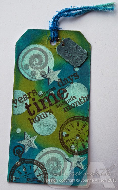
starting post for the current theme of "paint" mentioned stencil bumping. I was intrigued and found she has a good video tutorial demonstrating the technique here. I went for a tag as it was nice to experiment on something rather than aiming for a piece to use on a card or other project.

I really liked the effect Leandra got by using the translucent paints over the opaque ones so my colour choices for the base were dictated by what I had in my stash (I've had a transparent blue in my paint collection forever and a day and I had PaperArtsy's Hey Pesto translucent as well as Tinned Peas so blue/green it was!).

I followed Leandra's guide for the base layers and the stencilled circles and then did an extra layer by adding the stars, overlapping the circles in places. My "stencil" was created with a couple of circle punches and a Crop-a-Dile as all my existing stencils are really a bit too fine-patterned (certainly for a learner!).

Using both Mermaid and Snowflake when sponging in the top shapes gives a nice subtle variation of colour, I think and the sanding step really helps with overall coherence.

When I overstamped the painty base, I wanted the word "time" to stand out more so I went over it with a black marker and then clear Wink of Stella. I hadn't planned to stamp on the circles but that swirl was just the perfect size on the larger circle that I couldn't resist the temptation.

There's a second painty thing on the wee hanging tag - the chipboard piece with the year (just metal punches bashed into the chippie with a hammer) was given a base coat of very dark blue and then dry brushed with a couple of lighter paints. I think it gives a nice patina-ish look.

I thought I might use this as a bookmark so steered clear of adding any embellishments on the body of the tag.

Stamps: Clocks Plate 6 by PaperArtsy

Ink:
Brilliance Graphite Black
Hero Arts Charcoal

Other:
PaperArtsy Fresco Finish acrylic paint (Mermaid, Snowflake, Tinned Peas, Hey Pesto)
Midnight Blue and Turquoise acrylic paint by DecoArt
Random transparent blue acrylic paint from stas
Sizzix Thinlits Tag Collection dies
Small tag cut from waste mountboard with Tim Holtz Apothecary Bottles die
Number punches and leather pattern punch
Jump rings
Wink of Stella clear pen
Circle and star punches by Fiskars

Thanks for stopping by!

Saturday, 22 March 2014

Passage of time

Another slightly messier style card from me today - I did balance out a bit with a wide border though! This is a 6" square card and the mixed media panel is 4" square in the middle.

I've combined this week's Splitcoast Stampers Mixability challenge (use book print on your project) with the current Pan Pastel UK Challenge blog challenge to use three textures.

I used modelling paste with some plastic canvas. Once it was dry, I stamped the time sentiment with Versamark and used  Pan Pastel to colour over the paste and the stamping.

My second texture is the part circle cut from gold mountboard and dry embossed and the third is the star which is punched from tomato paste tube and beaten up with an embossing stylus then coloured with a Copic marker for a more copper tone. I used the same marker to make some neutral sequins and tiny pearls look coppery, too.

My French primer text came from the pack of paper ephemera I bought ages ago from a local trader who makes them up by putting together pages from books that are beyond hope in terms of being sold whole.

Stamps:
Clocks 3 by PaperArtsy
Essential Messages by Hero Arts

Paper: white and bitter chocolate

Ink: Versamark and Versafine Vintage Sepia

Other:
Maimeri Light Modelling Paste
Tomato paste tube metal
Fiskars squeeze punch - star
Uber embossing folder
Watch face
Sequins
Nail art pearls
Pan Pastel - Burnt Sienna Shade
Old book page
Scor-It board
Corner Chomper

Thanks for stopping by!


Sunday, 7 October 2012

Cherish Today - Tando hop

Welcome to the Tando Creative hop - we're finishing up our week's celebration of Tando's third birthday with a blog hop that explores Tando's history! If you didn't start at Tando Creative you might want to do that so that you can follow along and be in with the chance of a prize if you leave comments as you go.

The wavy arch I've used as the base of my project was one of Tando's earlier releases - February 2010. It's a nice arch shape and the wavy base makes it just that bit different. Since I had the VerDay paints out for yesterday's jewellery project I decided to do the arch while I was at it. I painted the arch with Iron paint and then once it had been left to dry, I embossed in a folder that had more of the Iron paint brayered onto it so that I got paint in the recessed bits of the design. I gave it a spritz with the patina solution and then set it aside to rust!

I've also used some of the leaves from the Tando Minis that were added to the range this summer - the grey board gives Copic colouring a nice rustic finish! A stamped sentiment. shrink plastic pocket watch and some flowers finish it off.

Supplies:
Wavy Arch (Tando Creative chipboard)
Leaves (Tando Creative Minis)
Foliage M-Bossabilities folder by Spellbinder
VerDay paint (Iron) and Patina Solution by Ten Seconds Studio 
Sentiment from Wings stamp set (Darkroom Door)
Pocket watch from Clocks Plate 6 (PaperArtsy)
Vintage Sepia Versafine and Vintage Photo Distress inks
Copic markers
Shrink plastic
Roses (Wild Orchid Crafts)
Pearls

Next stop along the hop is the talented Carol - don't forget to leave a comment here if you'd like to be in with a chance of this fantastic birthday blog hop prize!


Thanks for stopping by!


Thursday, 17 March 2011

Golden Santa

I've combined a couple of challenges today - Hazel's Christmas challenge this week is to "go for gold" and I used the sketch from Splitcoast Stampers' regular Wednesday challenge. I did a mirror image of the sketch provided as my Santa needed to face into the card to look right.

My background piece was made by sponging ink onto milky white cardstock and then dragging the edge of an old credit card over an ink pad and onto the panel. I used some variegated metal leaf to make a random frame round the Santa image and rubbed some Rub n Buff wax over it to blend the colours a little and make it a bit more subtly golden rather than very bright in-your-face metallic! As it is, the golden splodge combined with the glitter framing made it very difficult to get a decent photograph.

The sentiment is embossed with white powder onto a piece of metal from a tomato paste tube cut with a Spellbinder die and aged with a Copic marker and a little more Rub n Buff.

I was aiming for a bit random and worn with the glittered border but I'm not sure that it doesn't just look a bit slapdash- ah well!

Stamps:
Noel 2 (Paperartsy)
Sentiment from Season's Greetings (Technique Tuesday)

Paper:
Cryogen White

Ink:
Adirondack by Ranger (Espresso)
Distress ink by Ranger (Vintage Photo)
Versamark by Tsukineko

Other:
Detail white embossing powder
Rub n Buff by Amaco (Gold Leaf)
Copic markers (Santa is slightly tinted with Eggshell, Pale Cherry Pink and Warm Grey 1)
Easy Metal by Eberhard Faber
Tomato paste tube
Fancy labels dies by Spellbinder
Sewing machine and thread
Spica glitter pen (red and green)
Fine gold glitter


Thanks for stopping by!