
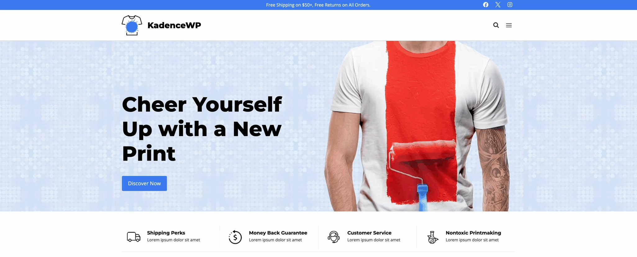
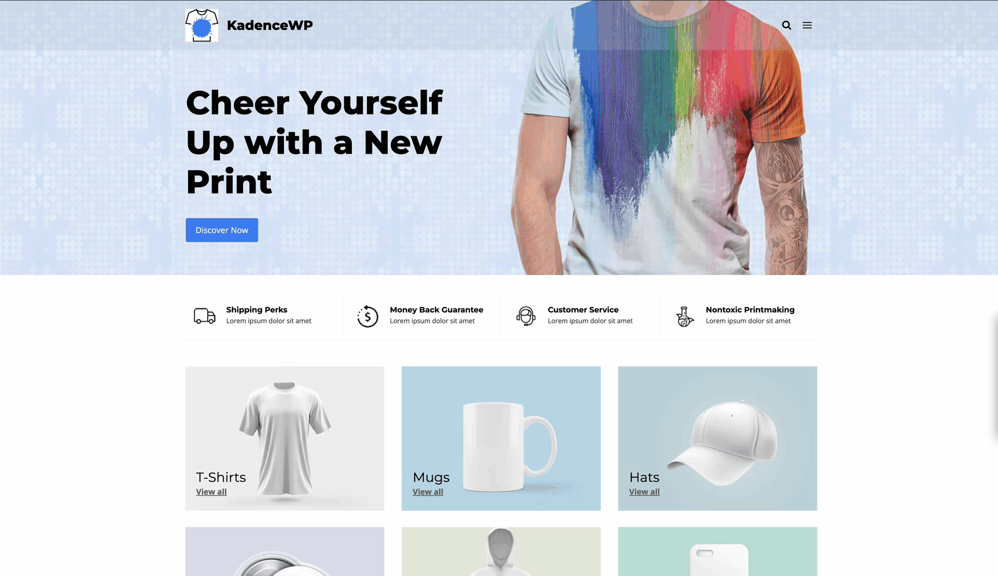
Kadence Hooked Elements features the Fixed Section element type. This is an element type that remains in a fixed position on the screen, overlaying the current post or page content. You can place Fixed Elements at the top or bottom of the page and choose to display them on scroll or immediately on page load.
Common use cases where a Fixed Section element comes into play include:
- Sticky promotional banners.
- Floating action buttons.
- Quick contact or chat buttons.
Unlock the powerful features of Hooked Elements with Kadence Theme Kit Pro.
Getting Started
You must have the Kadence Theme Kit Pro plugin installed, activated, and licensed on your website. (Click here to learn more.) Once Theme Kit Pro is active on the website, enable Hooked Elements from the Dashboard -> Appearance -> Kadence page.

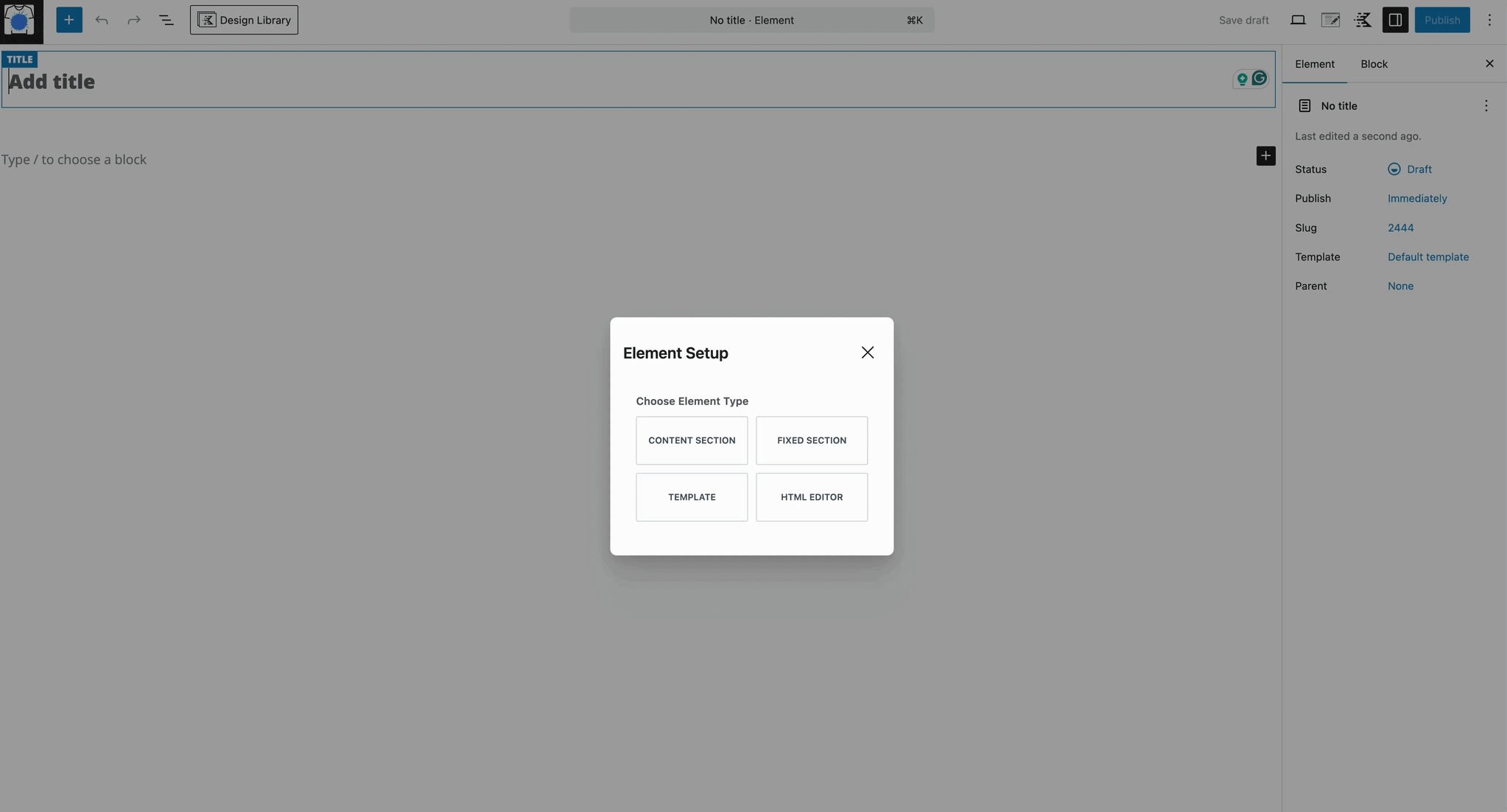
Once Hooked Elements are enabled, navigate to the Dashboard -> Appearance -> Kadence -> Elements page and create a new element by clicking the Add New Element button.

Select the Fixed Element type. Within the element, you can add the content you wish to fix on the screen by using a combination of blocks.
Then, use the Placement Settings to adjust the placement/behavior of the element and use the Display Settings to control the display settings of the element.
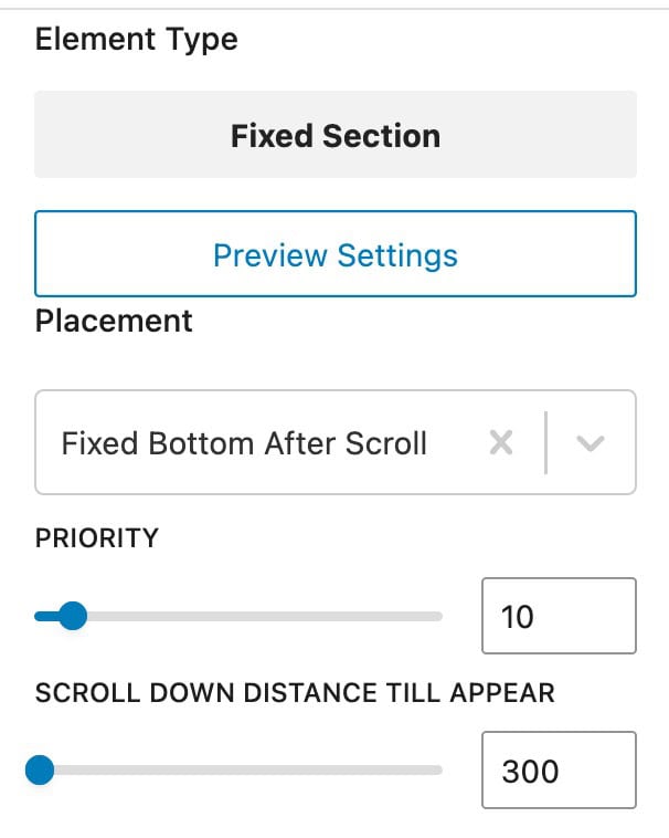
Element Settings
Use the Element Settings to control the placement, along with various display settings to determine where and who sees the element.
The Element Settings can be found at the top right corner of the element editor. Look for an icon with a paper and pencil.

Preview Settings
The Preview settings allow you to set the context and display size for the Element preview. The preview settings are helpful when designing an Element and will only affect what is seen in the editor.
EDITOR WIDTH (PX): Setting the editor width can be helpful if you are creating an Element that is targeting an area which is limited in width such as the Sidebar.
SELECT PREVIEW POSTS TYPE: Select Posts, Pages, or a Custom Post Type.
Select Preview Post: Choose a post to use as an example while creating your Element.

Placement Settings
There are seven (7) options for the Fixed Section placement. Each placement option offers settings to further customize the placement choice. Some placement settings activate after a scroll or immediately on the initial page load. When using a Fixed Section element, the placement controls a large portion of the element. So, setting the right one for the right case is important. Learn more about each placement option below.
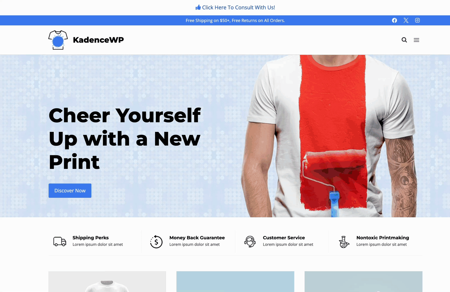
Fixed on Top
The Fixed On Top placement places the element content at the top of the page. It will move the header and content area down to prevent the element from overlapping existing content.
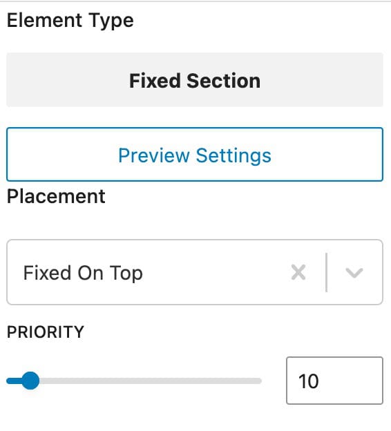
Priority: Set the loading order whenever multiple elements are used within the same hook. Lower numbers load first.
Fixed Above Transparent Header
The Fixed Above Transparent Header placement works the same as and offers the same placement settings as the Fixed On Top placement mentioned above. However, this setting is specifically for posts/pages that have a Transparent Header enabled.
If you are using a Transparent Header and notice it overlaps with the Fixed On Top placement, use the Fixed Above Transparent Header option instead. In this case, you should ensure you are using the Fixed Above Transparent placement instead.

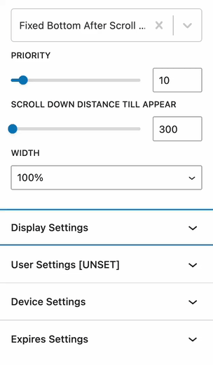
Fixed Top After Scroll
The Fixed Top After Scroll placement setting shows the element content after a user scrolls on the page. The value set for the “Scroll Down Distance till Appear” option (in pixels) controls how soon or late the element will show. The default value is 300, but you can set this from 0 to 30,000.
Priority: Set the loading order whenever multiple elements are used within the same hook. Lower numbers load first.
Scroll Down Distance Till Appear: Set the distance, in pixels, for how far down the user must scroll before the Fixed Element becomes visible.
Width: Define a width. By default, the 100% option will be selected, which takes up the full width of the device. Use the auto option to size the element based on its content, or use the fixed option to define a custom width in pixels.
Position: When using an auto or fixed width, define whether the element will appear on the left or right side of the screen.
X Distance From Edge: When using an auto or fixed width, define the horizontal distance from the edge.
Y Distance From Edge: When using an auto or fixed width, define the vertical distance from the edge.

Fixed Bottom After Scroll (No Space Below Footer)
The Fixed Bottom After Scroll (No Space Below Footer) placement places the element content at the bottom of the screen after a user scrolls down to a specified number of pixels. Additionally, this option ensures there is no additional space below the footer and offers controls over the element’s width.


Priority: Set the loading order whenever multiple elements are used within the same hook. Lower numbers load first.
Scroll Down Distance Till Appear: Set the distance, in pixels, for how far down the user must scroll before the Fixed Element becomes visible.
Width: Define a width. By default, the 100% option will be selected, which takes up the full width of the device. Use the auto option to size the element based on its content, or use the fixed option to define a custom width in pixels.
Position: When using an auto or fixed width, define whether the element will appear on the left or right side of the screen.
X Distance From Edge: When using an auto or fixed width, define the horizontal distance from the edge.
Y Distance From Edge: When using an auto or fixed width, define the vertical distance from the edge.
Fixed Bottom After Scroll
The Fixed Bottom After Scroll placement setting shows the element content at the bottom of the page after a user scrolls on the page.
Priority: Set the loading order whenever multiple elements are used within the same hook. Lower numbers load first.
Scroll Down Distance Till Appear: Define how far down the user must scroll before the Element is visible. (Measured in pixels).
Fixed On Bottom
The element content will show in full-width at the bottom of the screen right after page load, and it’ll stay there regardless of whether the user scrolls up or down.

Priority: Set the loading order whenever multiple elements are used within the same hook. Lower numbers load first.

When using this option, the element will always take up the full width. If you run into issues where you may be unable to click on links/buttons or see hover effects when hovering the bottom part of the page, consider using a different placement option, which gives you the option to control the width.
Fixed Bottom (no space below footer)
The Fixed Bottom (no space below footer) adds a fixed element to the bottom of the screen. Whenever you scroll down to the very bottom of the page, the Element will appear on top of the footer, rather than under the footer.

Notice in the image above, there is no space below the footer. The Element stops where the page ends. This is the main functionality of the Fixed Bottom (no space below footer) setting.
Notice in the image to the right that there is additional space below the footer. The space shown in the image to the right comes from using the regular Fixed Bottom placement option.
Priority: Set the loading order whenever multiple elements are used within the same hook. Lower numbers load first.
Width: Define a width. By default, the 100% option will be selected, which takes up the full width of the device. Use the auto option to size the element based on its content, or use the fixed option to define a custom width in pixels.
Position: When using an auto or fixed width, define whether the element will appear on the left or right side of the screen.
X Distance From Edge: When using an auto or fixed width, define the horizontal distance from the edge.
Y Distance From Edge: When using an auto or fixed width, define the vertical distance from the edge.

Display Settings
Use the Display Settings to determine where the element will take effect. Use the Add Rule button to include additional options.
- Available options: Entire Site, Front Page, Blog Page, Search Results, Not Found (404), All Singular, All Archives, Author Archives, Date Archives, Paged, Single Post, Category Archives, Tag Archives, Single Pages, Single Products, Brand Archive, Product Category Archives, Product Tag Archives, Product Brand Archives (Shop Kit), Products Archives, and Products Search.
Use the Exclude button to add an exclusion. For example, if you wanted to show an element on all pages of a website, except one, you can use the exclude feature to prevent the element from showing on that specific page.


User Settings
Determine which user role(s) will be able to see the element in effect.
- Options include: All Users (Default), Logged Out Users, Logged In Users, or based on the available current website roles.
- Use the Add Rule button to add more visibility options.

Device Settings
By default, all devices will see the element. Use the Device Settings to control which device types can see the element.
- Available options: Desktop, Tablet, and/or Mobile.

Expires Settings
Enable this option to add an expiration to the element. Once the expiration is met, the element will no longer take effect.

